How to make a distinctive product appeal to a broader audience?
Nomet brings seaweed to the table through a familiar favourite: the croquette.
Our mission was to give this distinctive proposition a stronger, more contemporary identity. We wanted to put taste and enjoyment first, making Nomet more inviting at first glance without losing the character that makes the brand different.
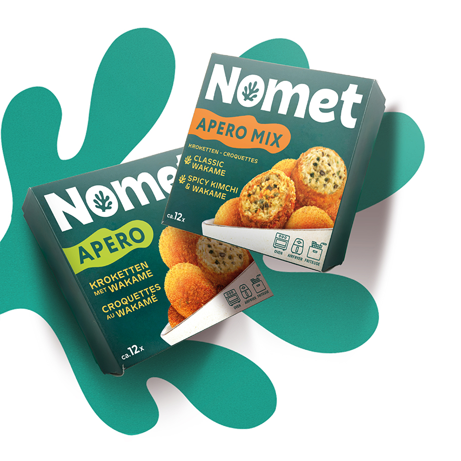
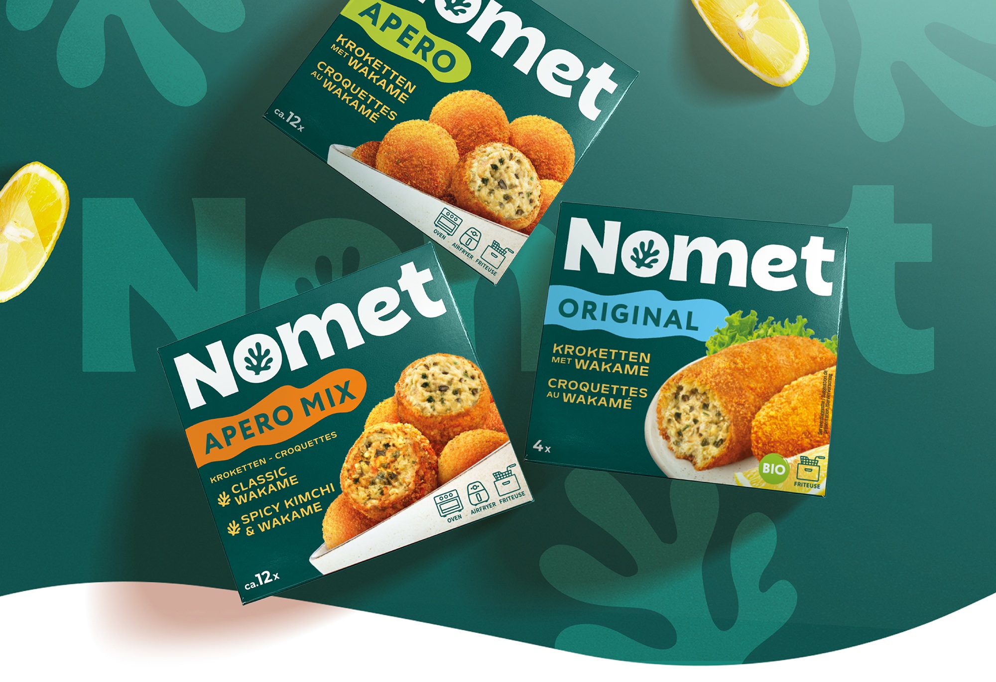
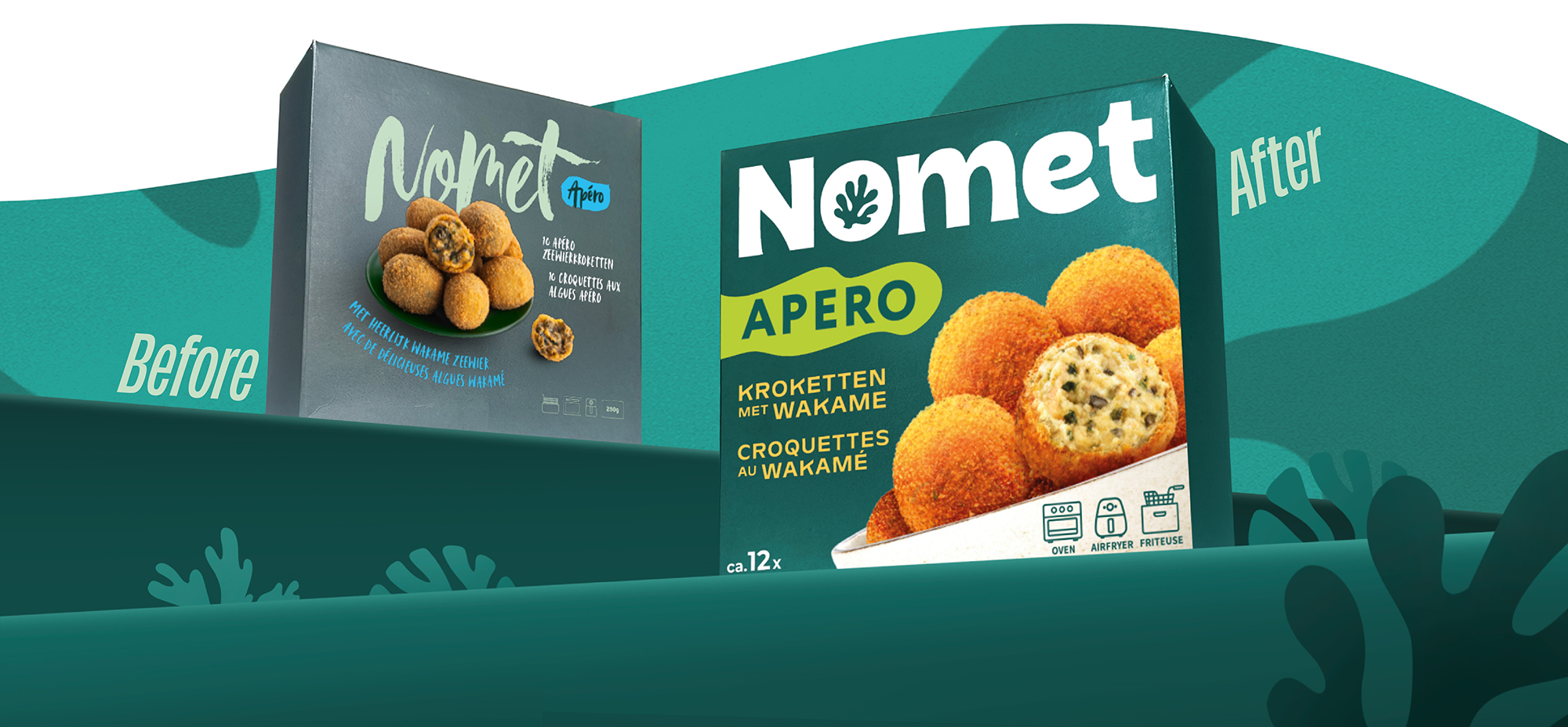
The redesign shifts the hierarchy towards what people want to eat. The croquettes became bigger, brighter and more appetising, while the Nomet name gained a much stronger presence.
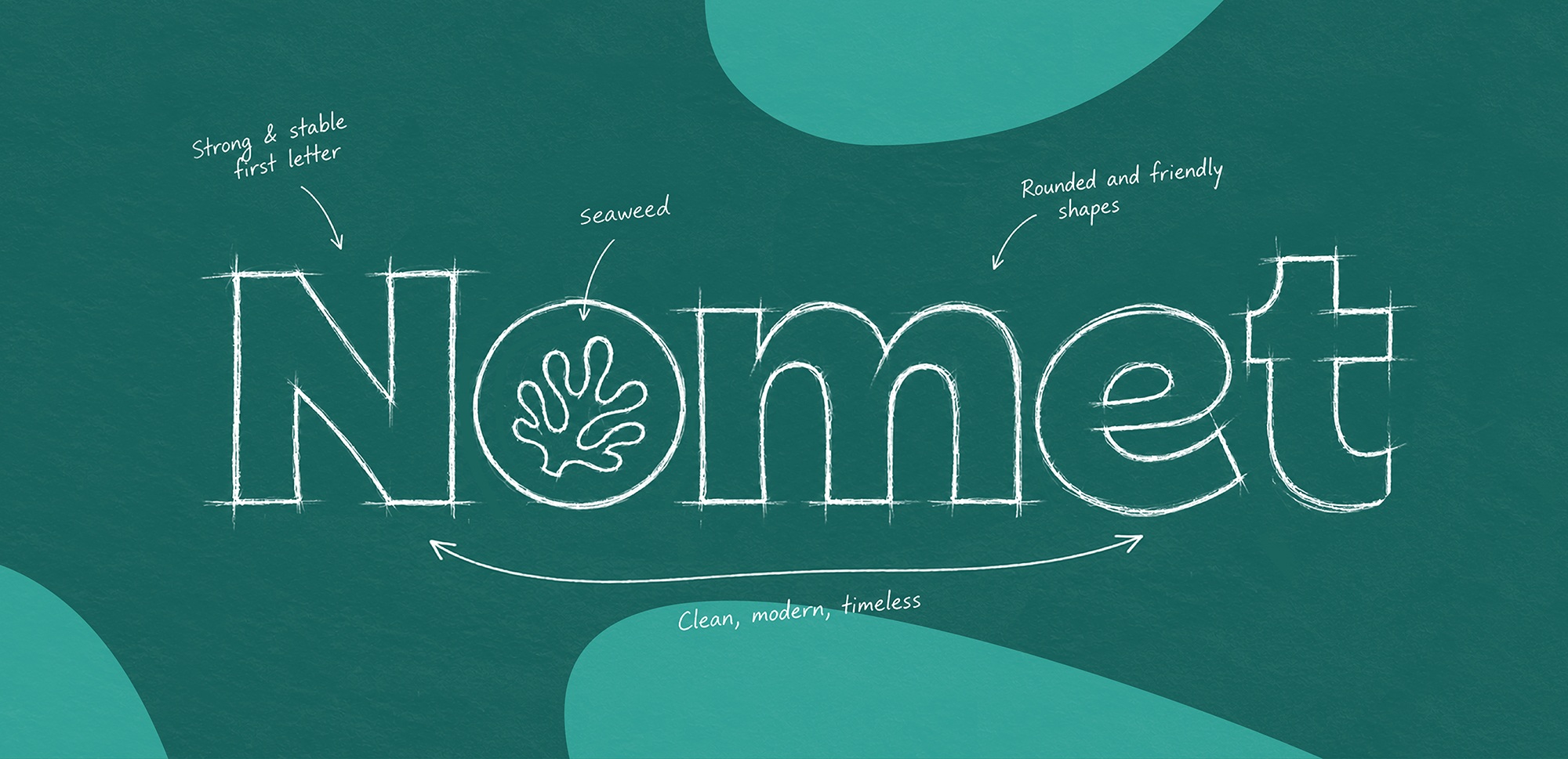
We replaced the handwritten logo with a bold, rounded wordmark and integrated a seaweed shape into the ‘O’, turning the brand’s hero ingredient into a recognisable visual signature.
A consistent green brand world brings the range together, while bright colour accents, clear naming and generous food photography give each product its own character.
The result is a more inviting product family, with stronger appetite appeal and a clearer brand presence, designed to spark curiosity and connect with a broader audience.
Beyond the pack
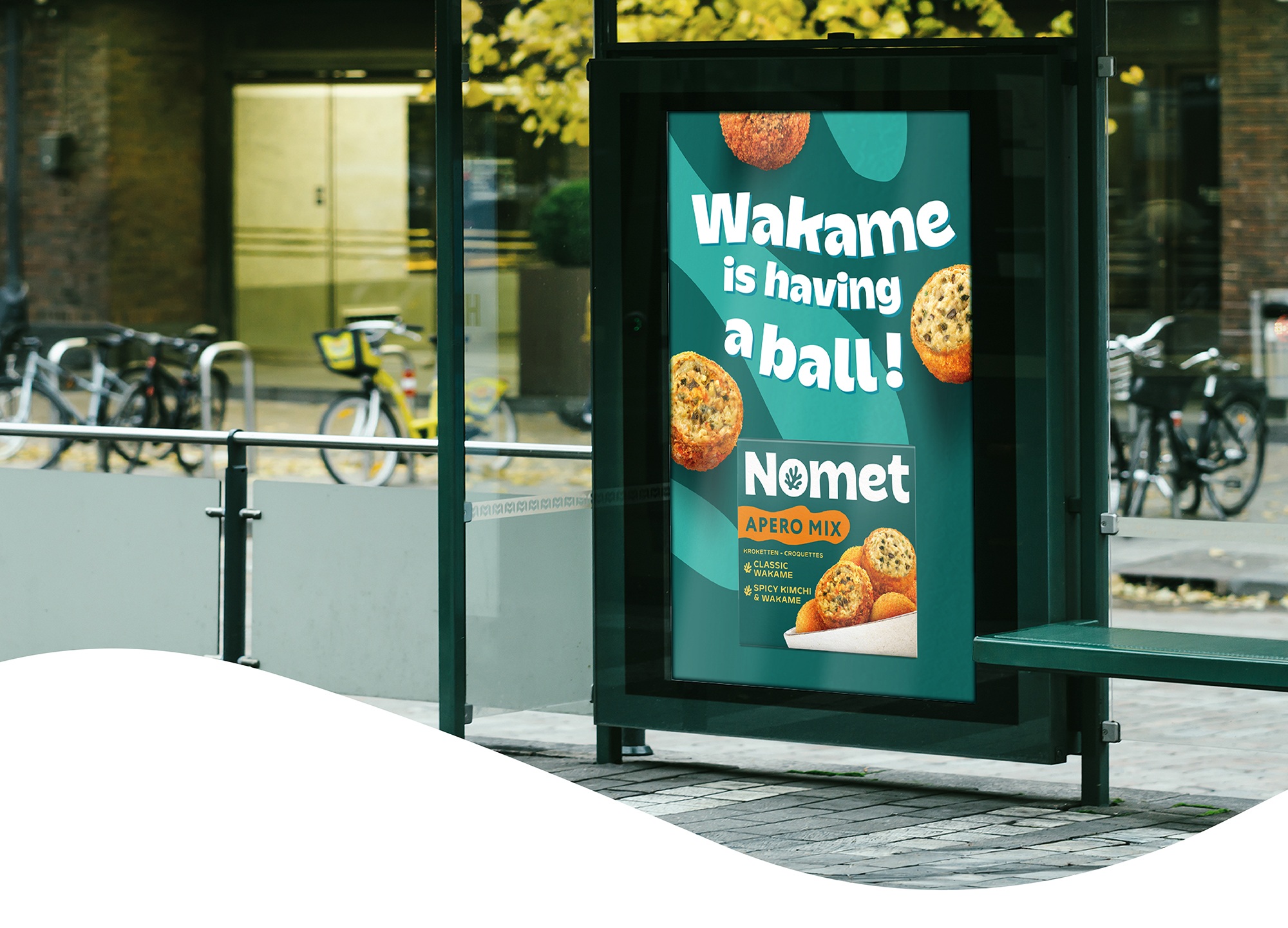
The new identity was designed to live beyond packaging. The seaweed-inspired shapes, typography, colours and playful tone create a recognisable visual language that can extend naturally across communication and brand touchpoints.
Others Projects