The Soubry Pasta Range redesign exercise
In Belgium, we also make excellent pasta! For over 100 years, Soubry has been producing a wide variety of pasta using high-quality durum wheat. In fact, their market share surpasses that of famous Italian brands like Barilla, Panzani, De Cecco, and others.
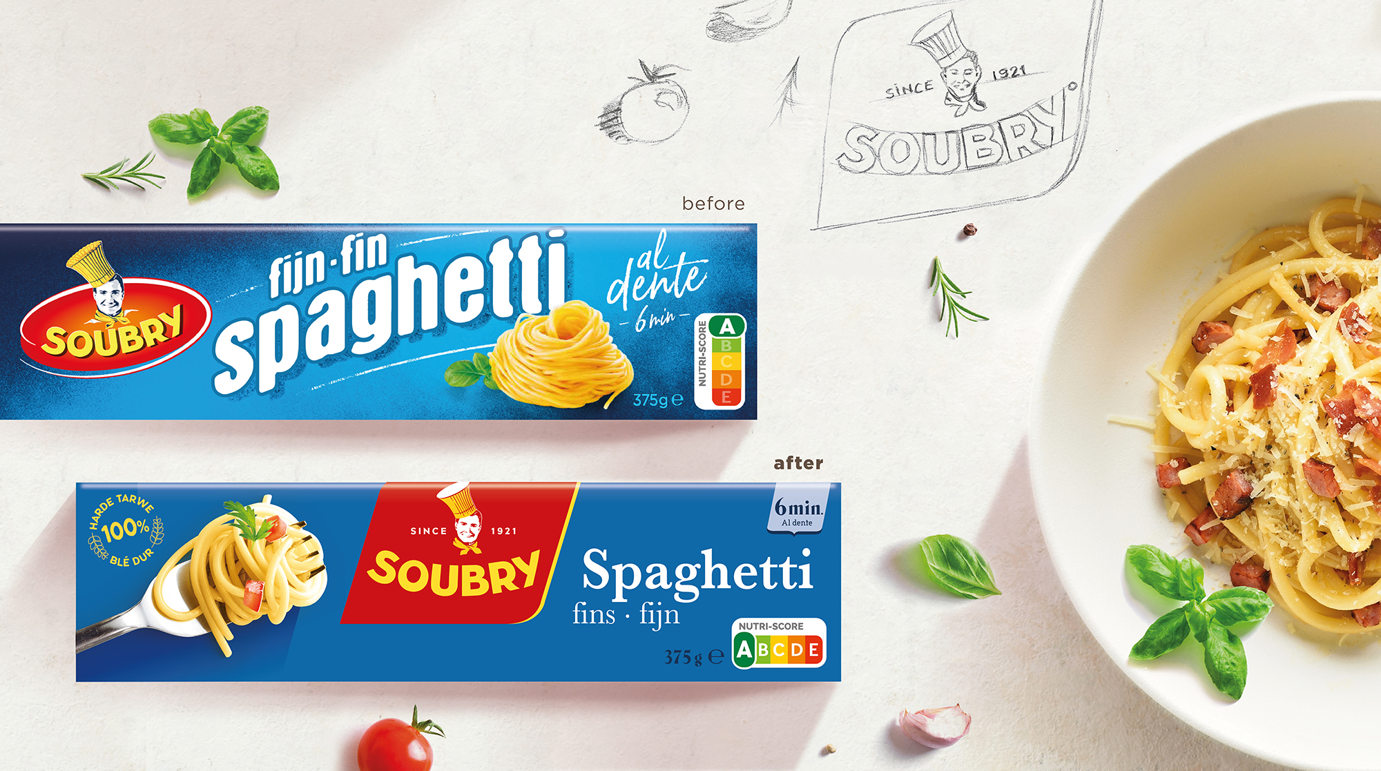
Our challenge was to help Soubry step away from its traditional branding and outdated packaging, elevating the perceived quality to match that of premium Italian brands. The previous packaging focused more on product descriptions than on creating a strong, recognizable brand identity.
Although the project wasn’t selected, we were inspired to show how we would approach the brief.
A fresh brand identity for modern packaging
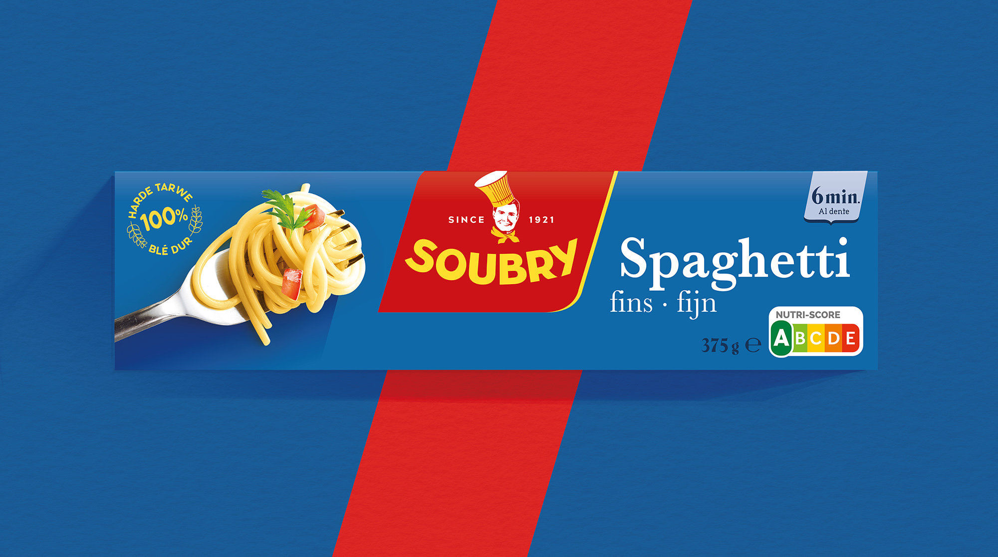
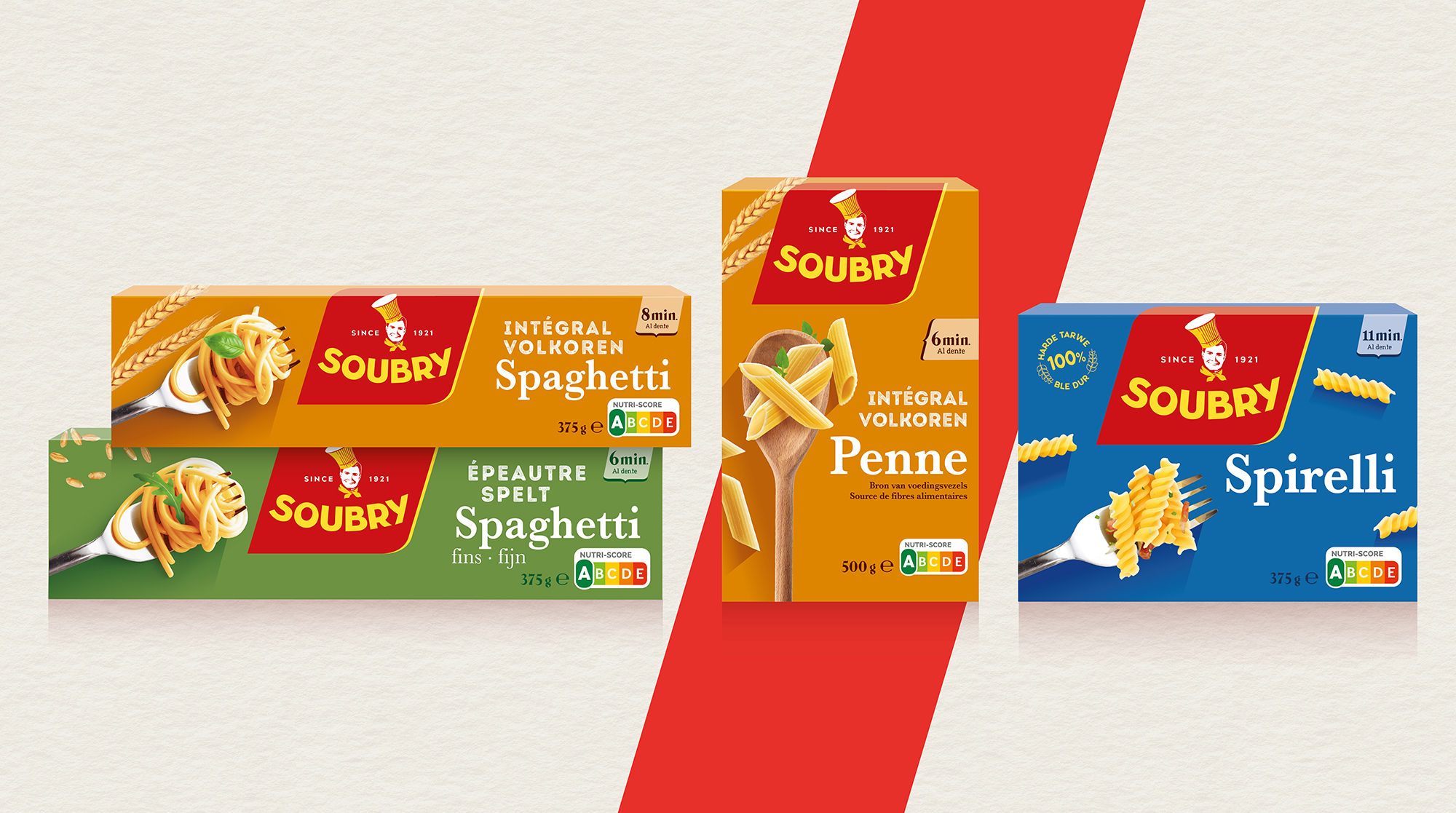
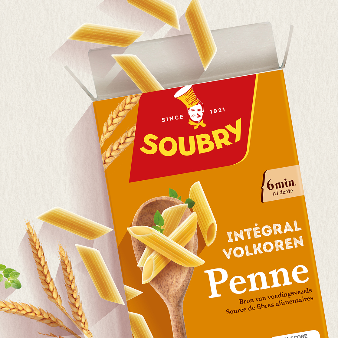
Our new brand identity proposal retains the iconic red and yellow colors while eliminating gradients and the greyish tones in the portrait of Mr. Soubry. The brand now takes center stage on the packaging instead of being tucked on the left, ensuring consistency across both horizontal and vertical pack formats.
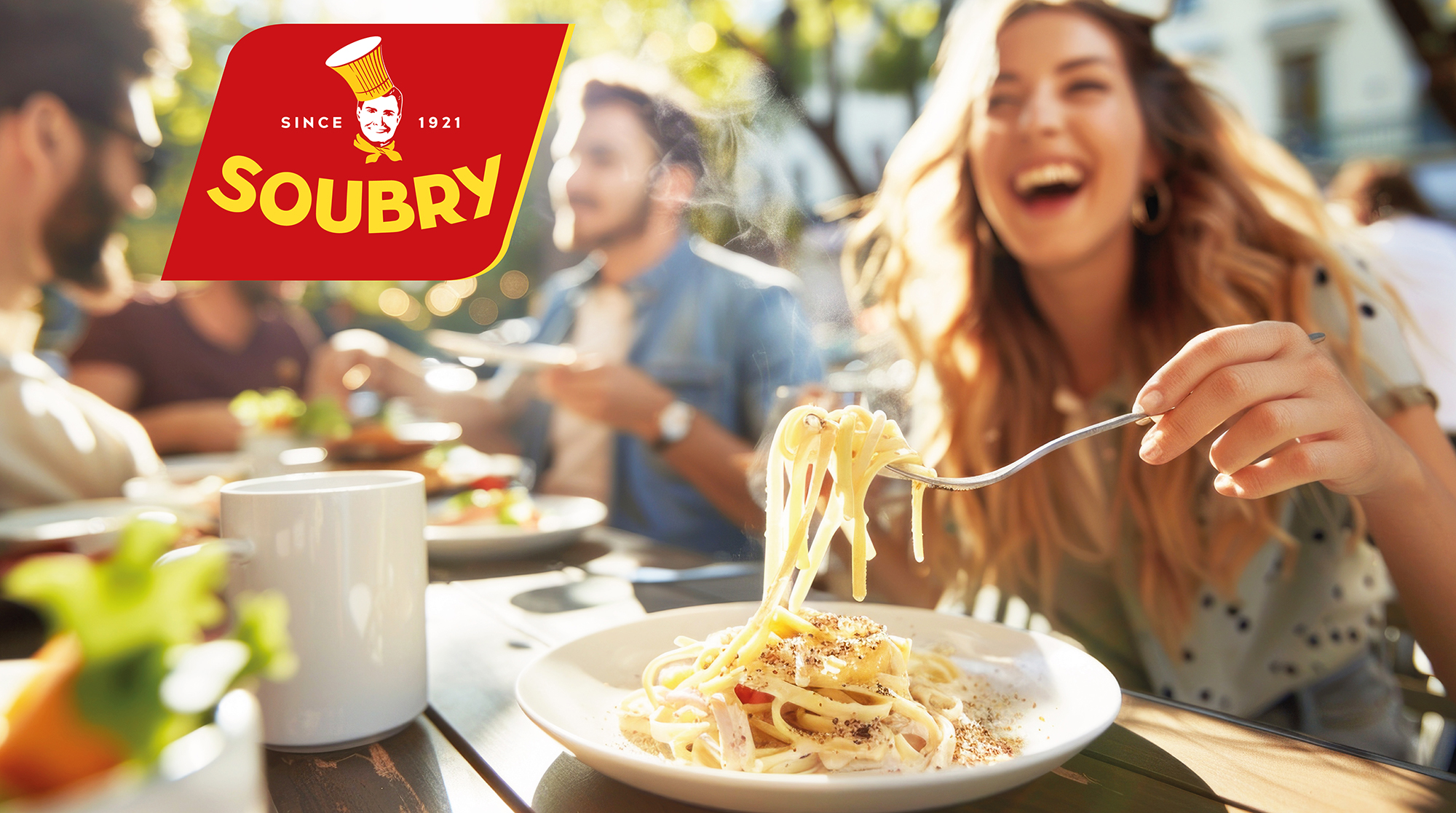
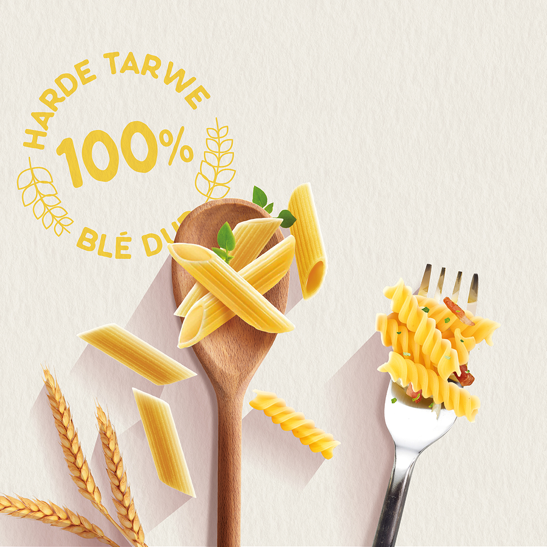
We replaced the oval logo with a diagonal red banner, enhancing shelf impact and immediate recognition. Product photography was refreshed to boost appetite appeal, and cooking time information was made more prominent.
To make the range even clearer, we adapted the background colors for different types of wheat: blue, green, and orange—helping consumers identify their preferred pasta quickly.
After this redesign exercise, wouldn’t you think you’re buying a premium Italian pasta range?
Others Projects