The Java coffee packaging rebranding exercise
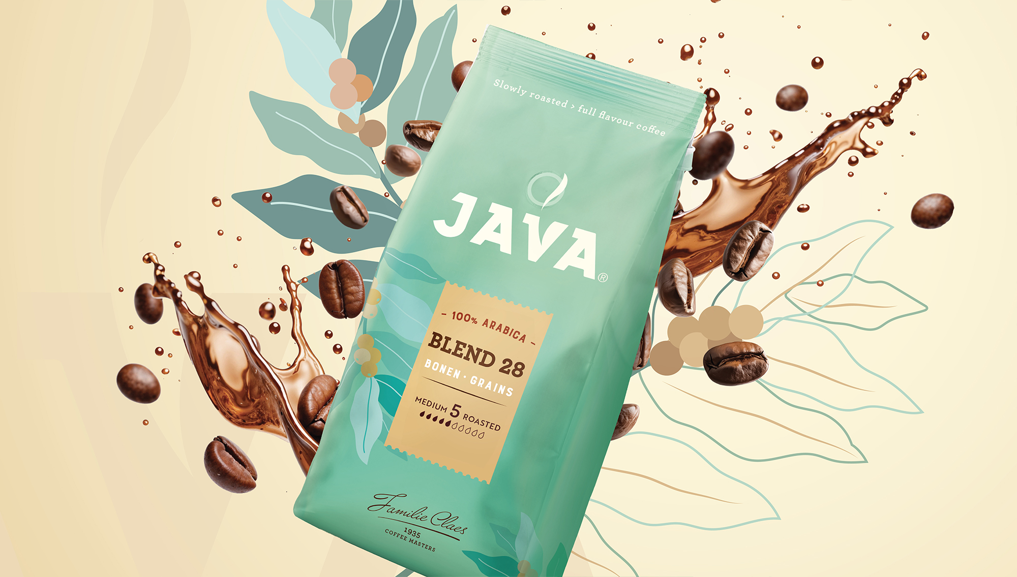
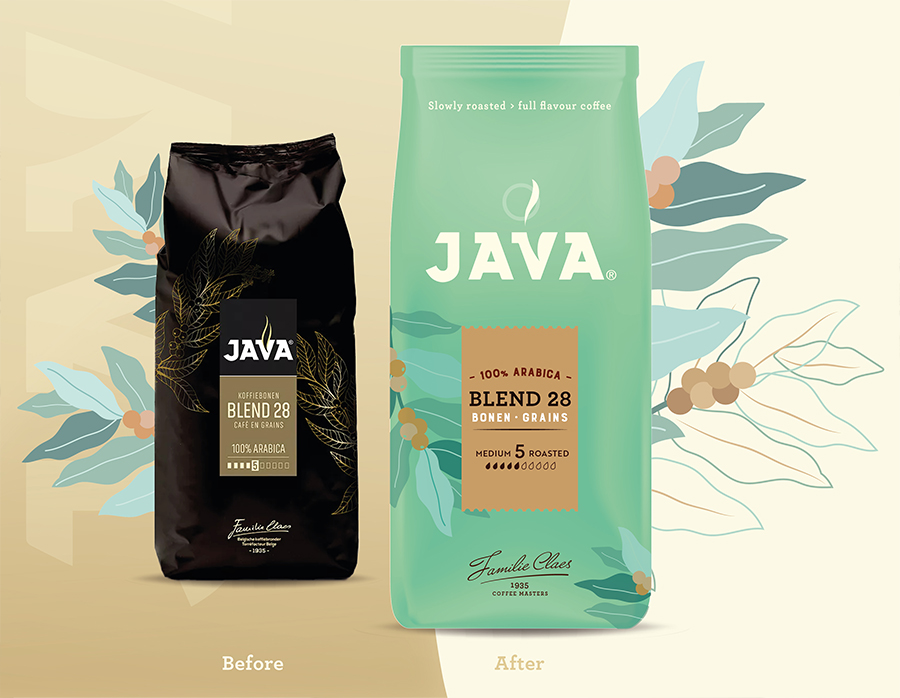
Java Coffee, a family-owned company led by the Claes family, set out to refresh its brand identity by replacing its traditional black background with a more distinctive light green. The challenge? Creating a recognizable, cohesive packaging system across multiple product ranges—without changing the standardized packaging materials.
Although the project wasn’t awarded to us due to budget reasons, we were inspired to explore our own creative solution and show how we would approach the brief.
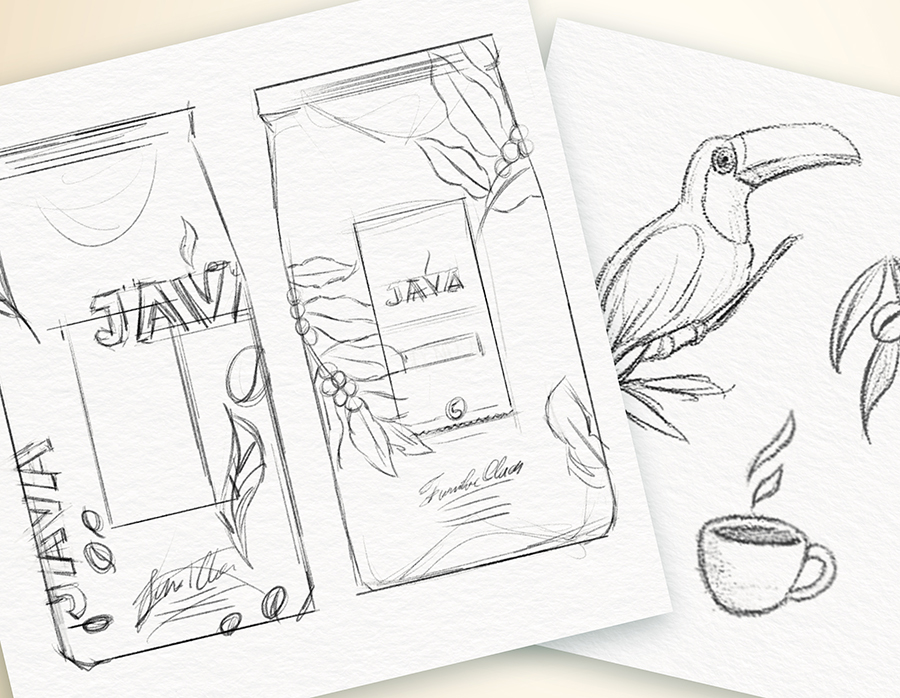
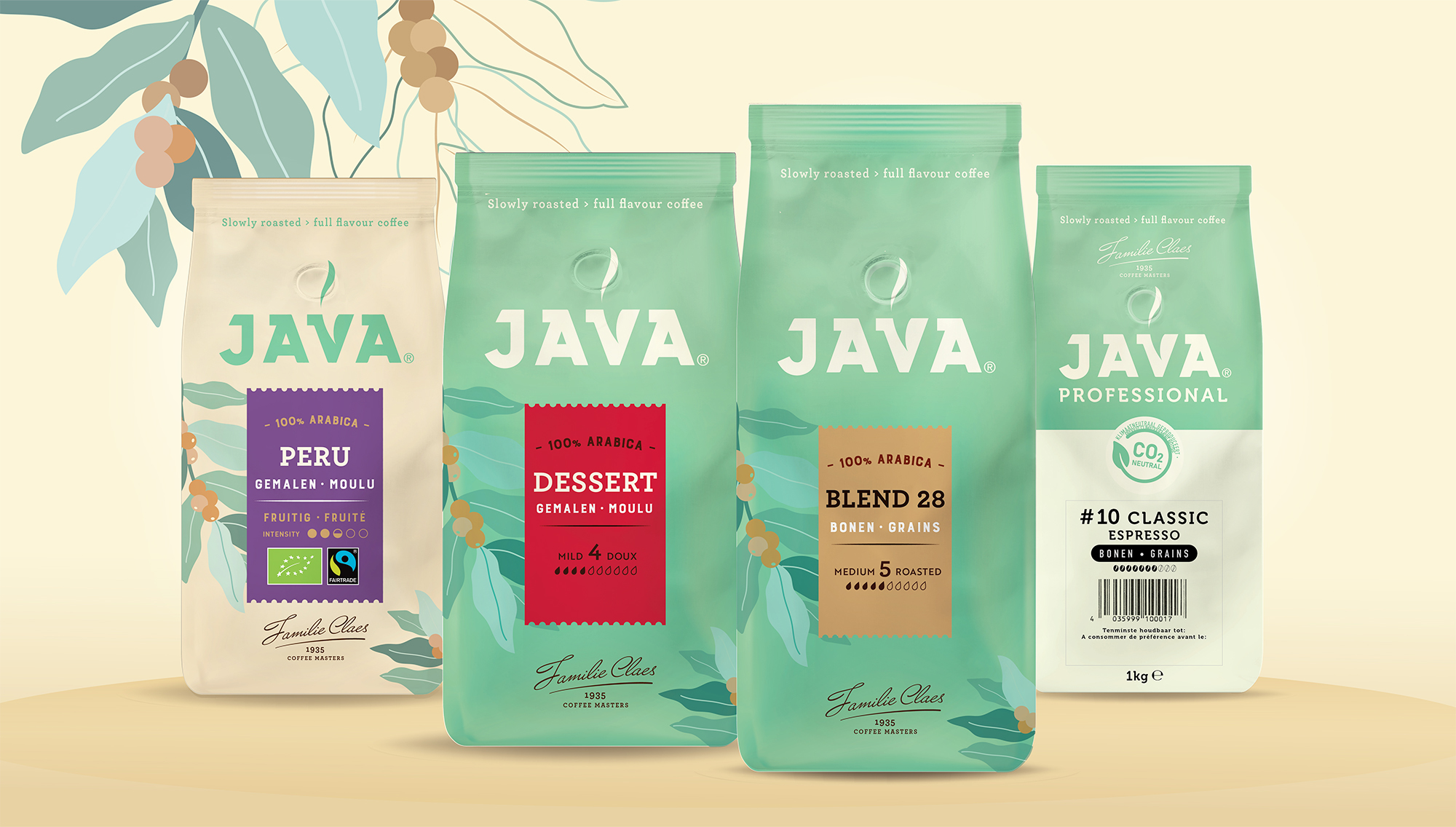
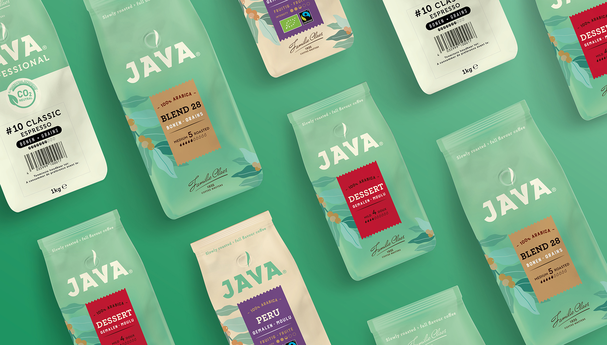
The brief was to maintain standardized packaging materials across three different product ranges, using only printed stickers to differentiate each variety. Our idea was to print the Java brand directly on the foil itself, rather than relegating it to small stickers.
The “Standard” beans and roast & ground coffee would feature the light green background, enhanced with subtle coffee tree leaf illustrations, the family’s signature, and the logo reversed out in white. The “Single Origin” range would use a beige background with the light green logo in positive print, while the “Professional” range would adopt a simplified design that retained the light green background and prominent branding.
The result? A refreshed, cohesive packaging design that enhances shelf impact and consumer recognition while celebrating the Java Coffee family’s heritage.
Others Projects