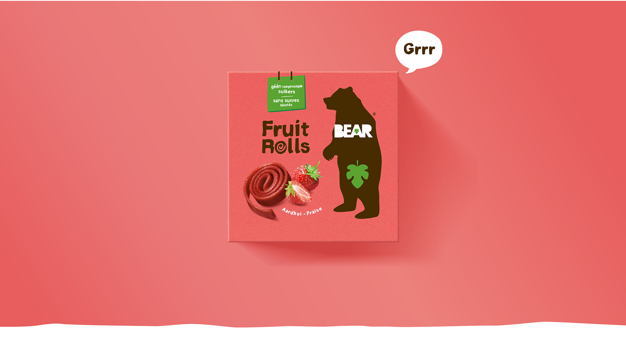
Bear new identity
HOW TO WIN A PITCH AND BECOME THE BRAND DESIGN GUARDIAN OF THE BEAR BRAND
OUR MISSION
Winning the global packaging identity pitch against big international design agencies in 2020 was a great opportunity to demonstrate our brand design skills.
Our mission was to elevate the existing BEAR YoYo brand to an “international level” and make the brand proposition understandable and noticeable everywhere.
OUR STRENGTH
Having a lot of experience managing international beer and chocolate brands in the past we had some knowledge of US, Asian and Middle East retail and consumer habits, very useful for this mission.
With a well thought strategic recommendation and our newly developed validation process we convinced the client to give us the lead on the rebranding mission.
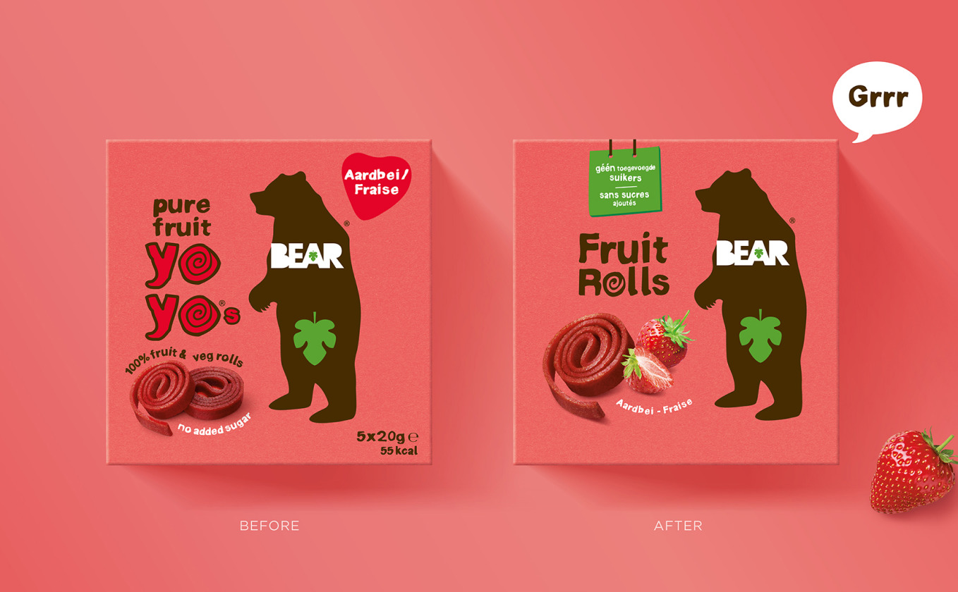
OUR SOLUTION
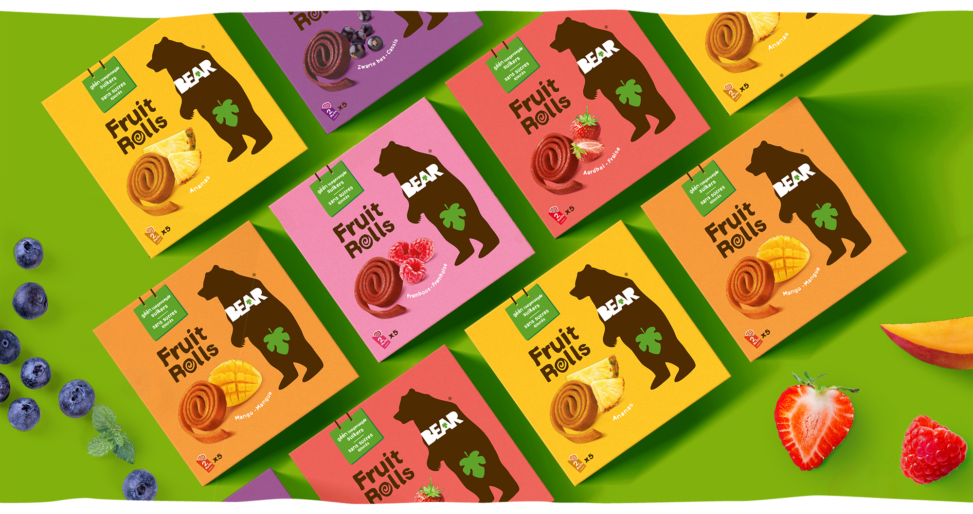
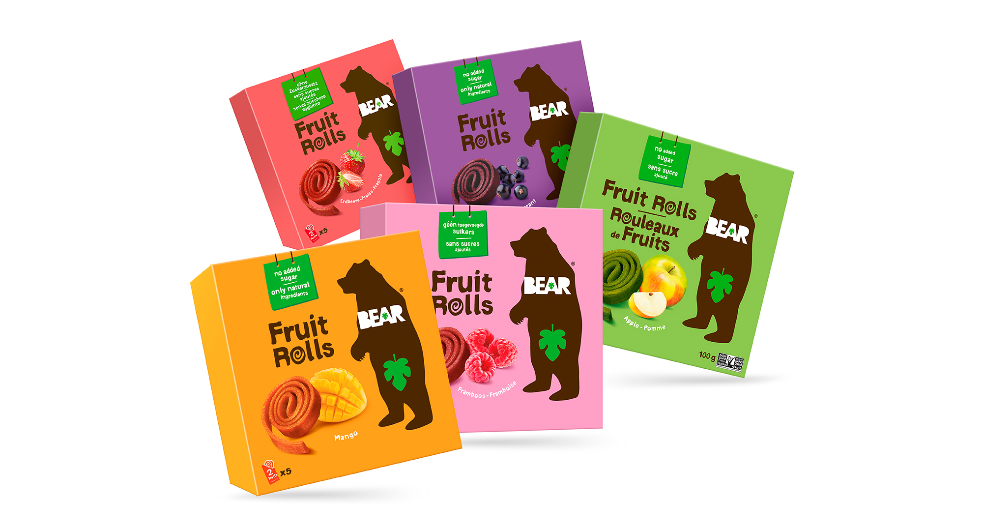
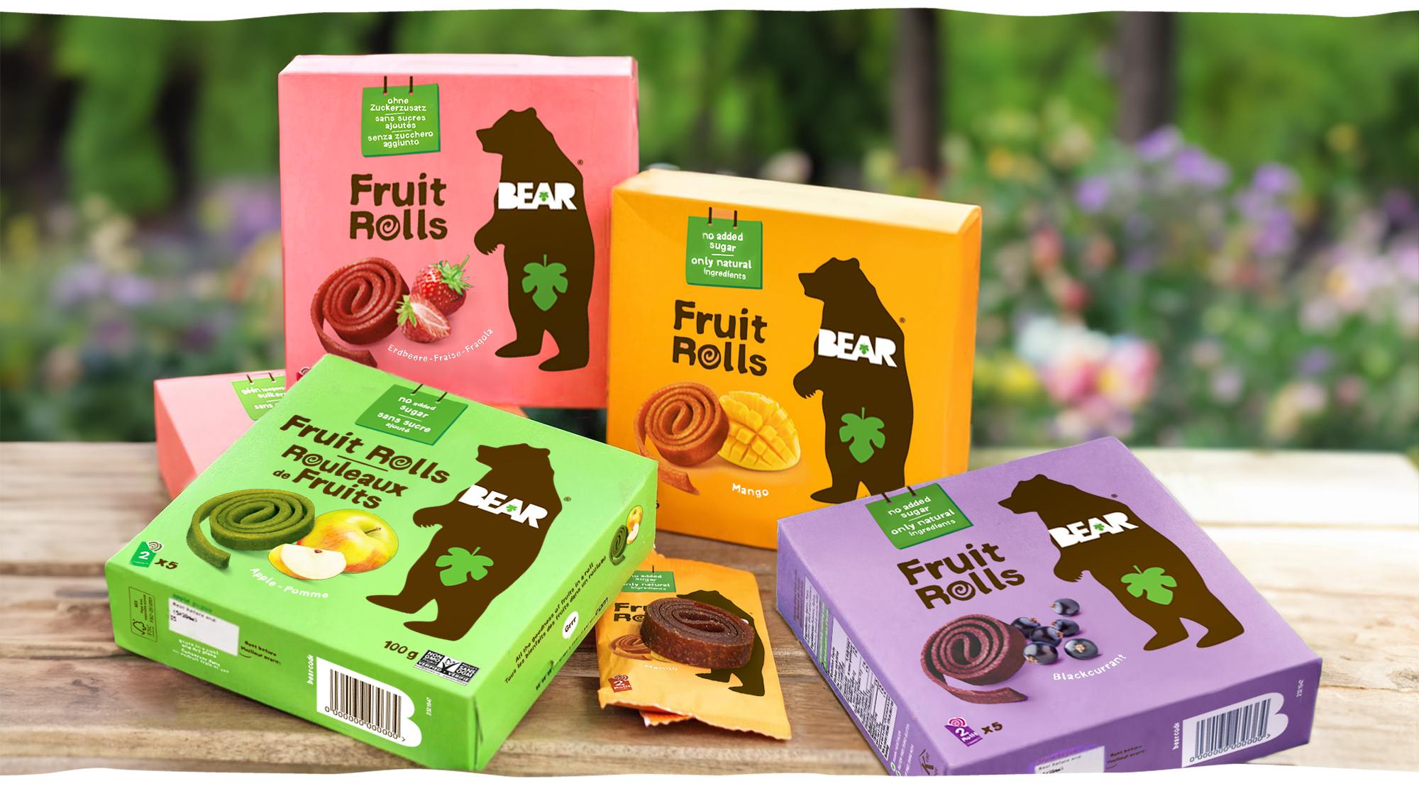
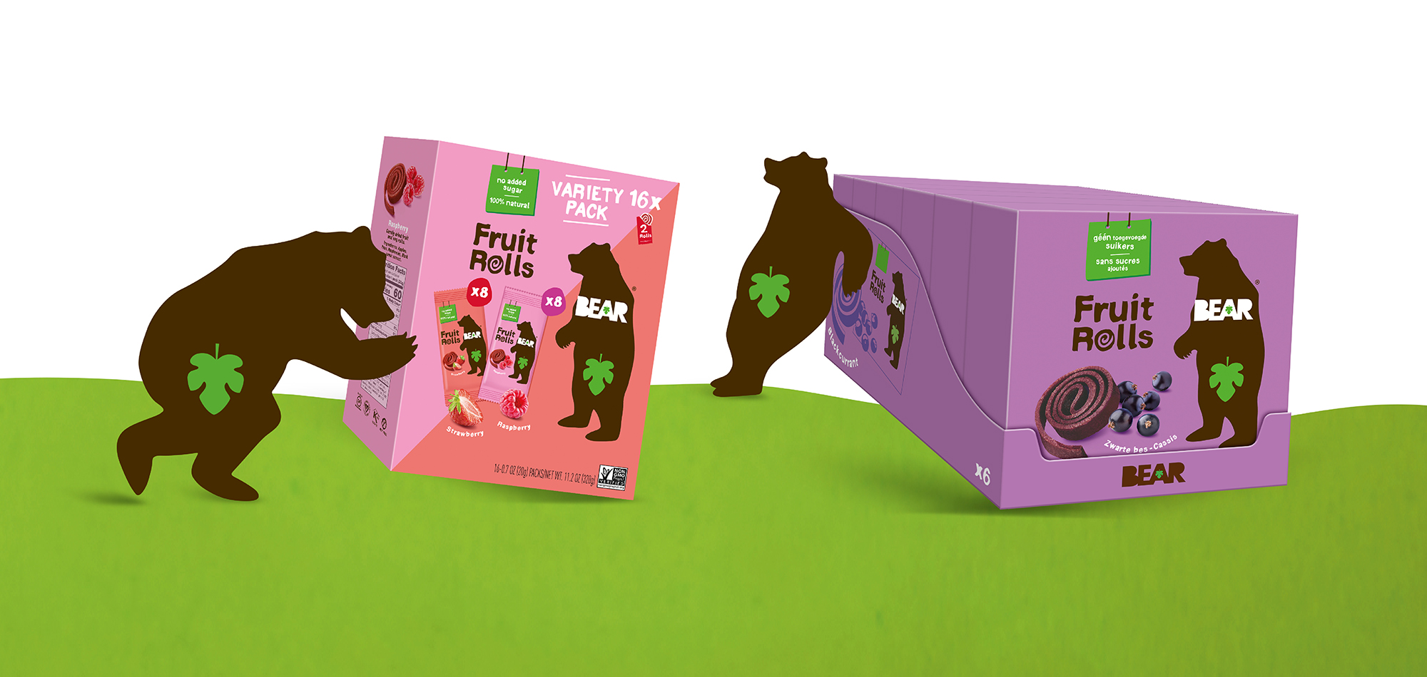
The BEAR 100% natural fruit rolls made of real fruit, initially called BEAR YoYo, where simply rebranded to BEAR Fruit Rolls. We kept the original design structure of the packaging but made a better communication hierarchy in order to carry out the main message, “100% natural fruit rolls with no added sugar”. Adding a fruit visual and using essential communication messages did most of the job.
THE CHALLENGE
The challenges of developing the designs for more than 15 countries (US, China, Poland, UAE, France,….) were all addressed. Defining the uncoated and coated background colors, making color print tests for each reference, developing the different line extensions, looking at the variety of packaging language clusters, finding solutions for smaller countries by using stickers ,….
We also had to harmonize the consumer images in order to have stable colors on digital supports whether it was for a sales presentation, client’s website, retailer’s e-commerce platforms and others. The RGB, Pantone or CMYK colors are definitely worth to be well managed.
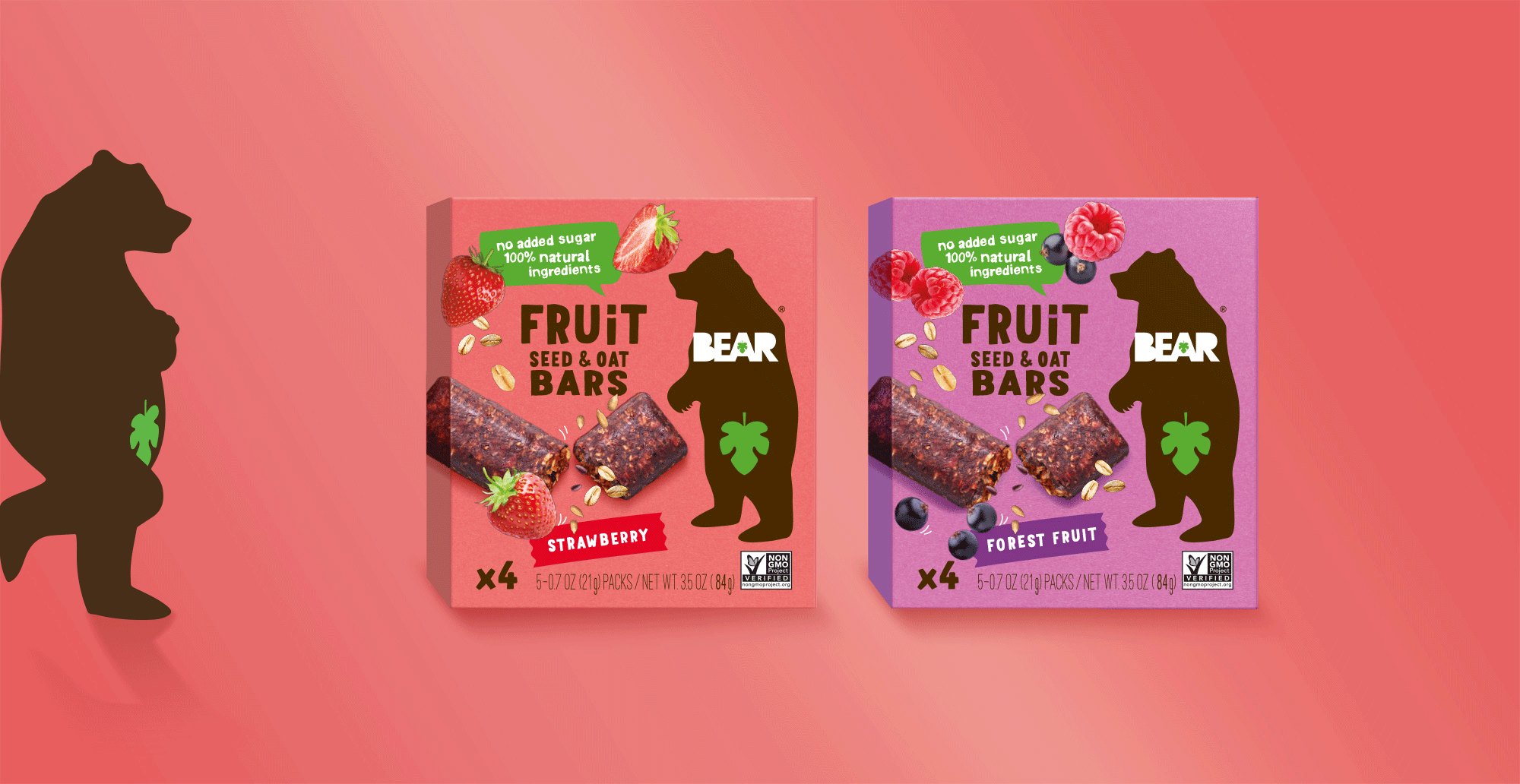
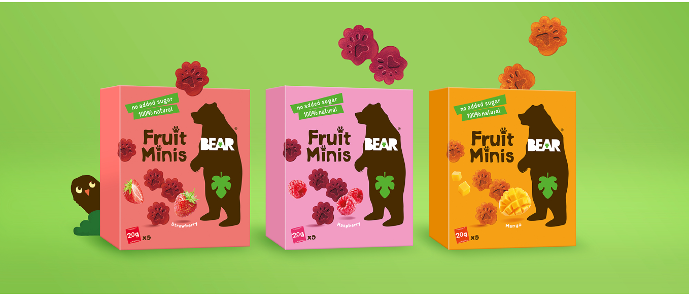
ADDITIONAL PRODUCT RANGES
We designed the new “fruit minis” and “fruit bars” range for BEAR international (US & Europe) as line extension of the existing fruit rolls range.
On the “fruit bars” design you can see an attractive bar visual and fruit images without losing the core visual identity= the bear drawing and the “free from” claims.
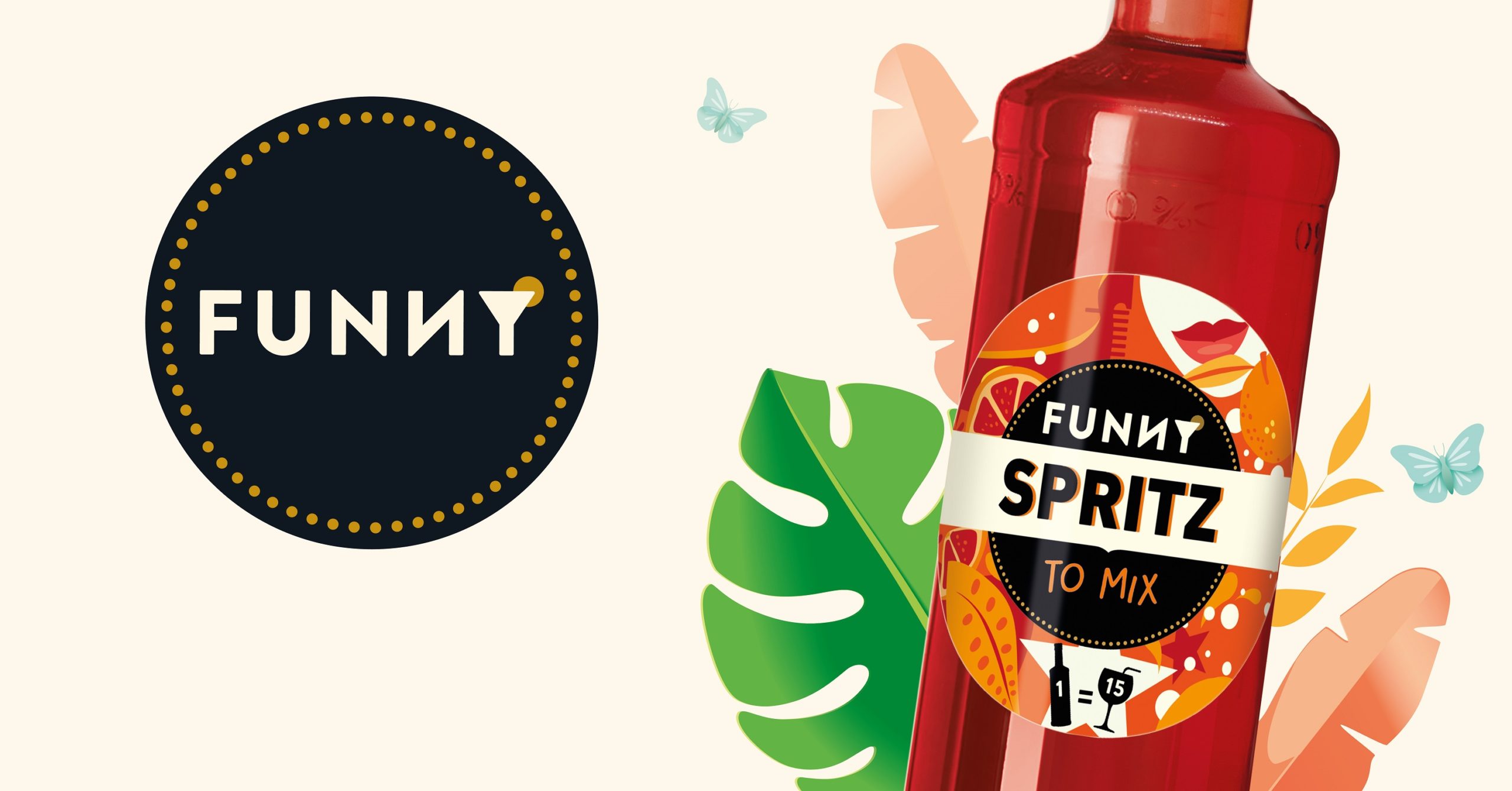
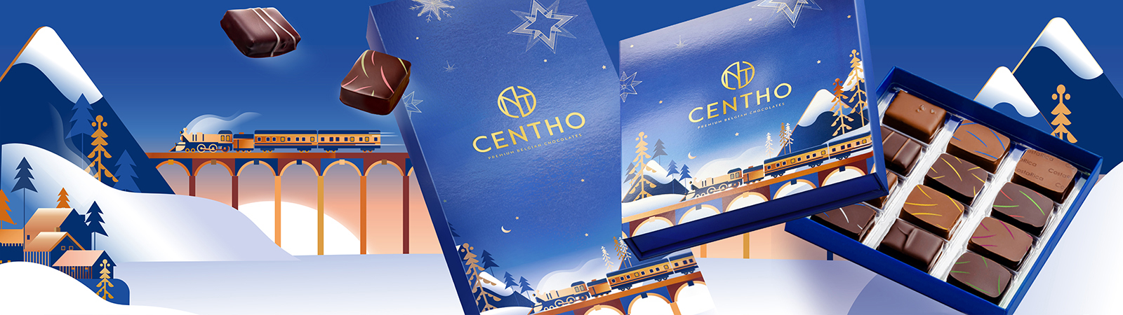
Others Projects