

Crius beer
We created a new Belgian beer for Lidl to answer the growing consumer demand of strong beers in Europe.
With our Brussels design team we started from three optional names and created a rich storytelling around them. As the Crius story of a Greek god, member of the Titans and represented by a ram figure, had the most potential we decided to go on with that brand name.
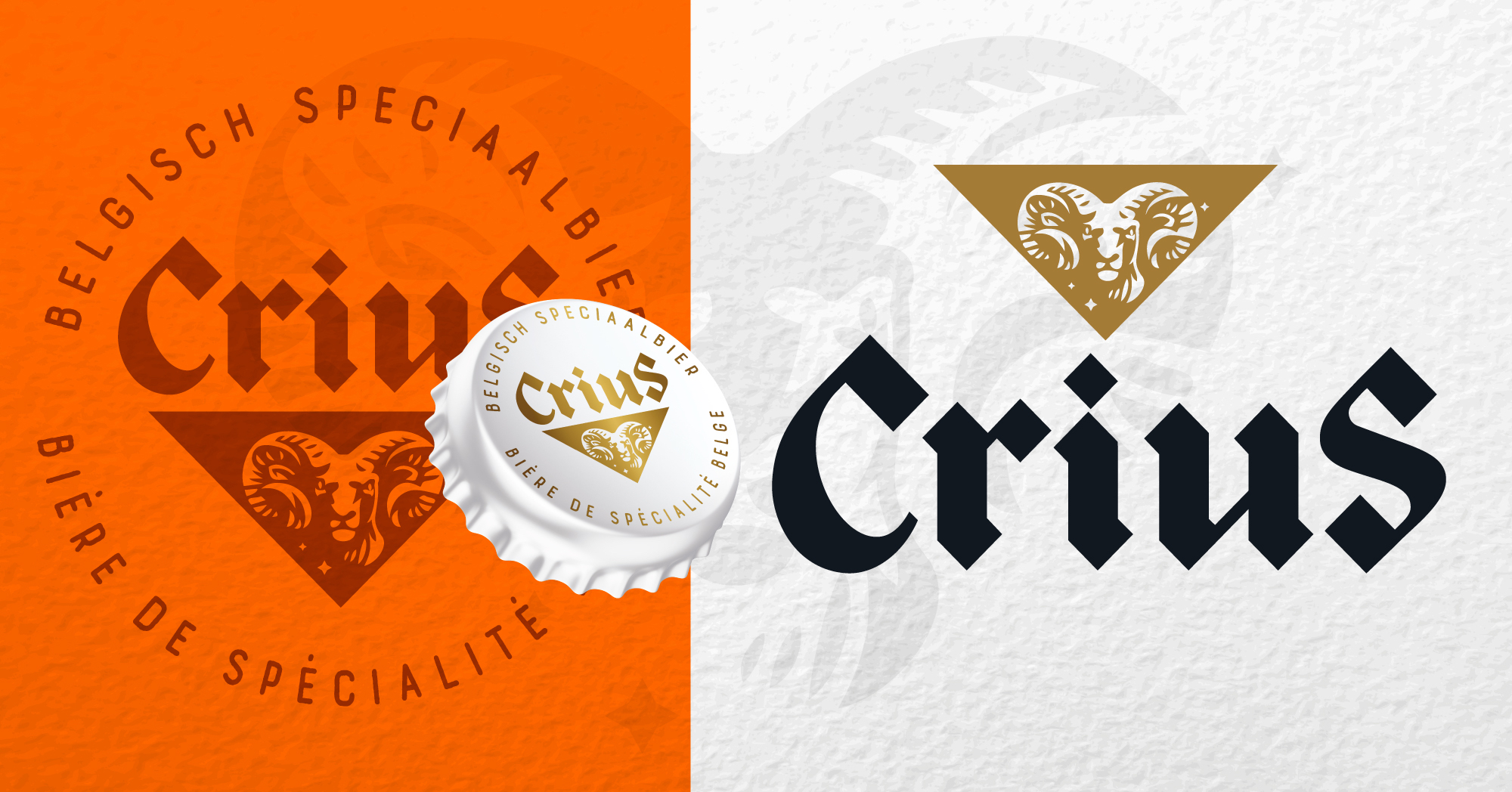
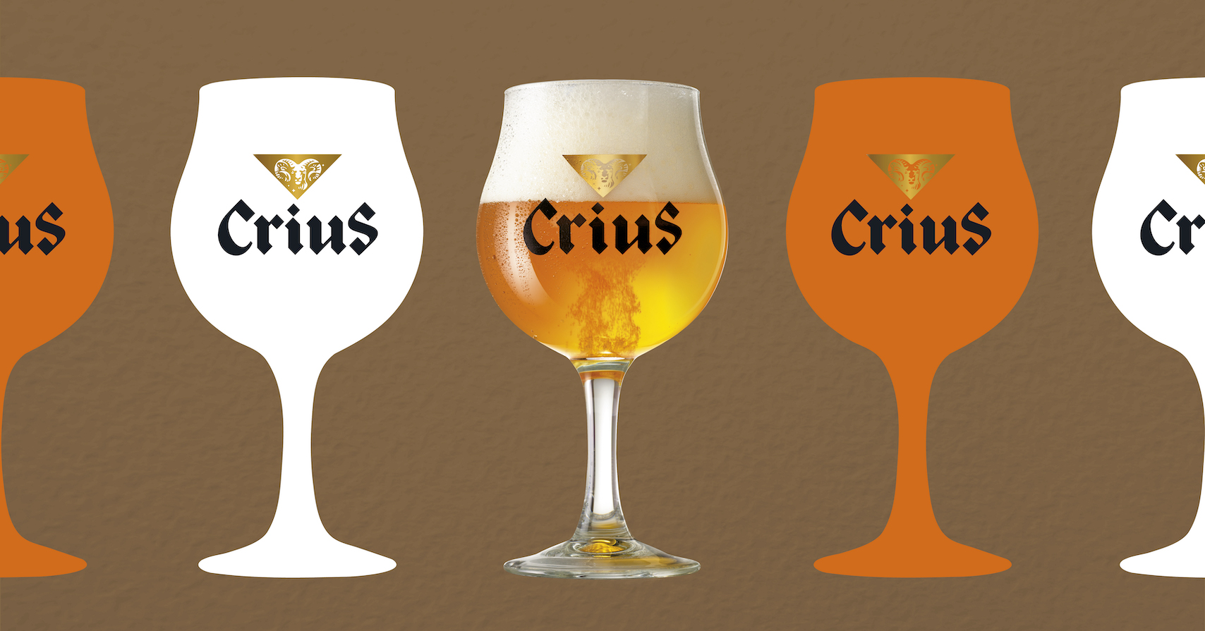
The Crius typeface is inspired by the traditional beer brands with an emphases on the “C” And “S” to give strength to the branding.
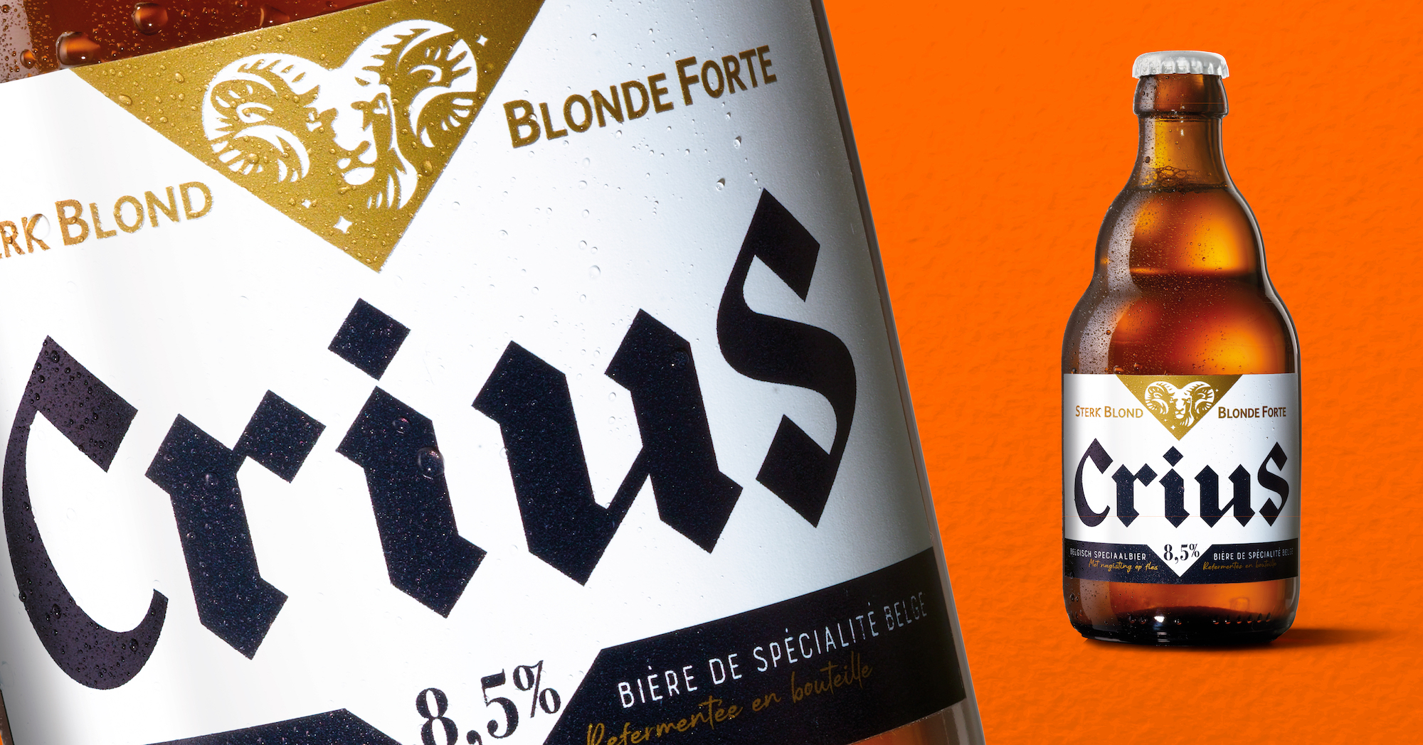
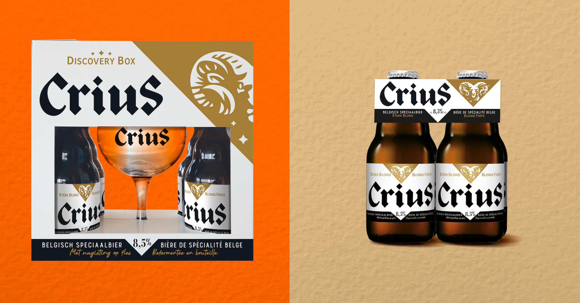
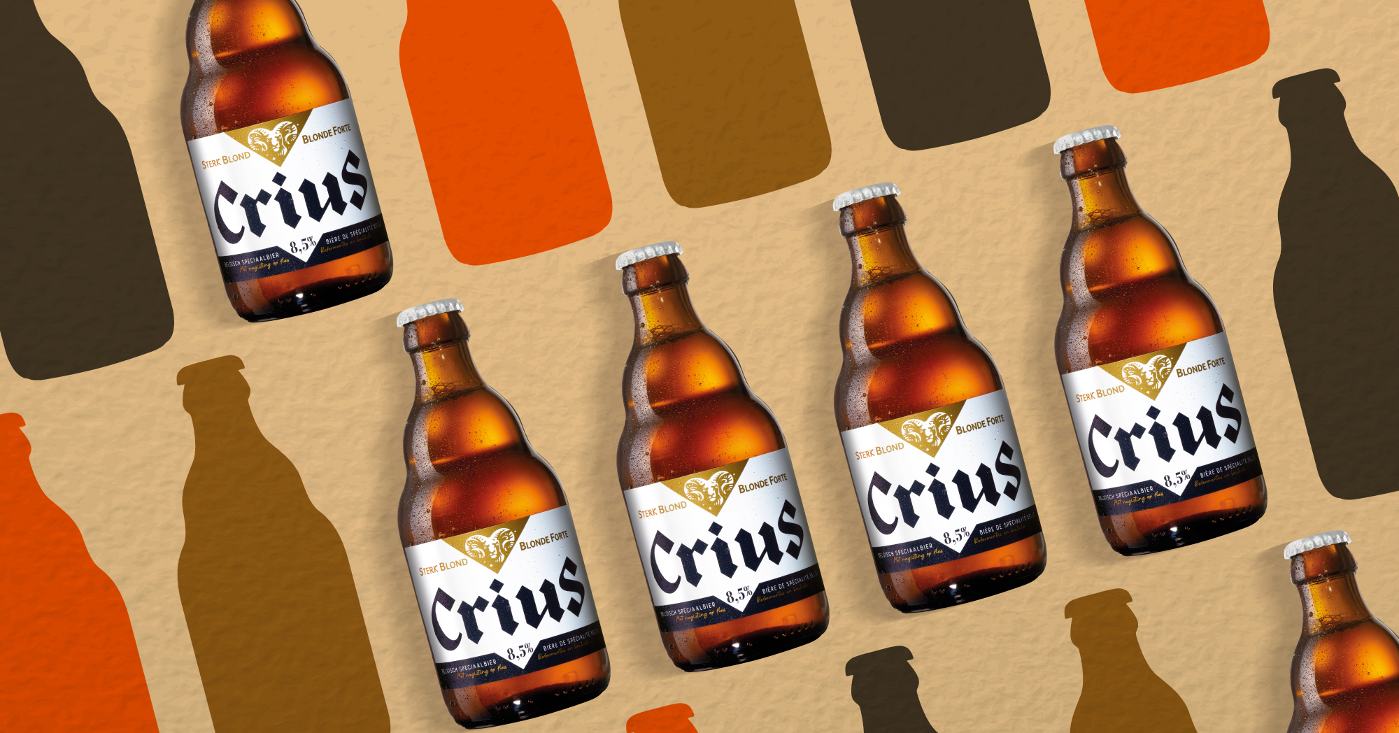
The label of the bottle, the giftbox , the new glass and other touchpoints were kept sober with a golden triangle representing a ram icon as common graphical element.
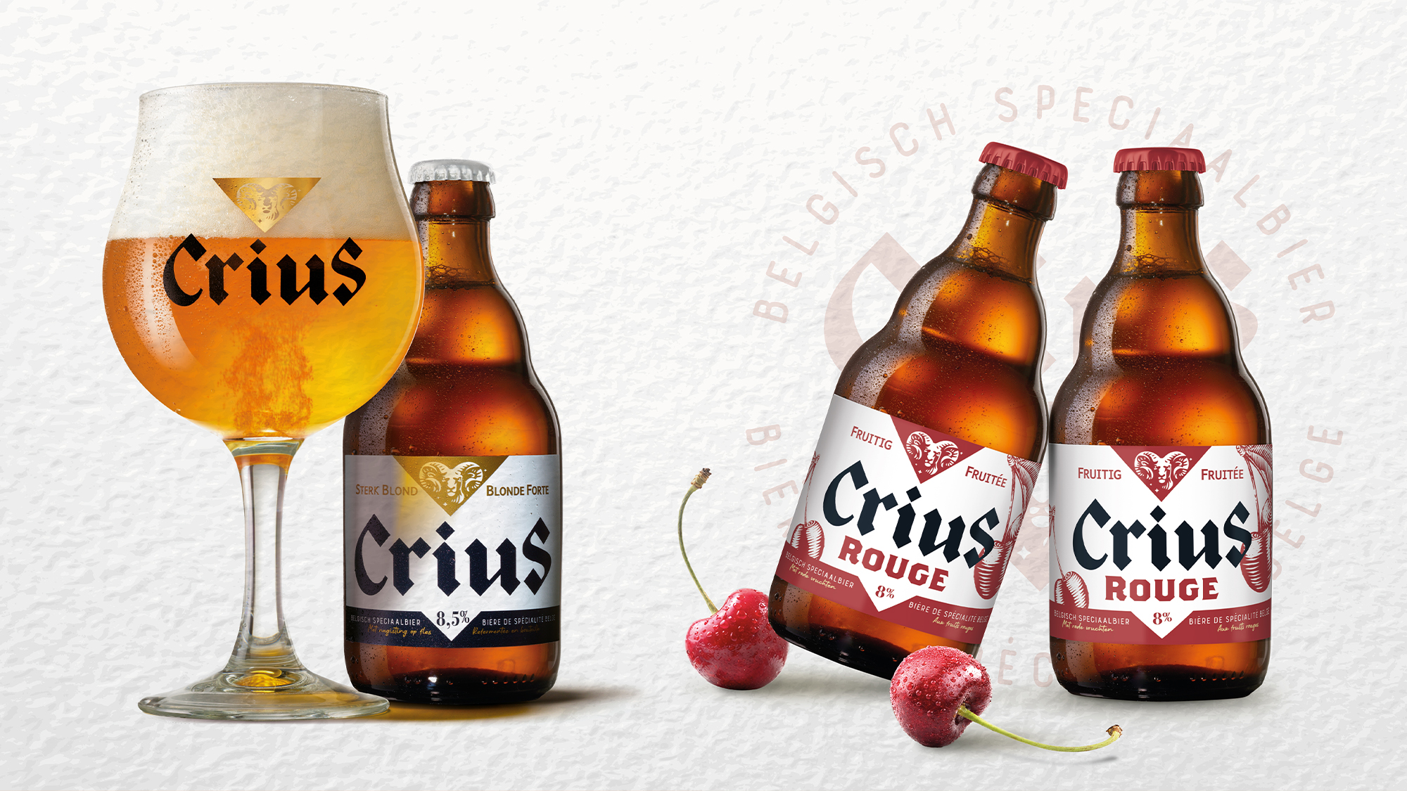
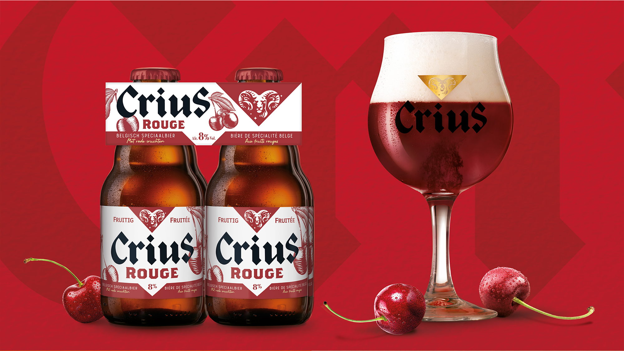
And as the Crius beer was a big sales success the Crius family was enlarged with the launch of the Crius Rouge, a fruity red strong beer. The existing Crius visual identity was easily adapted to this new variant while maintaining its core attributes.
Others Projects