

How to create a coherent visual identity across a large healthcare range
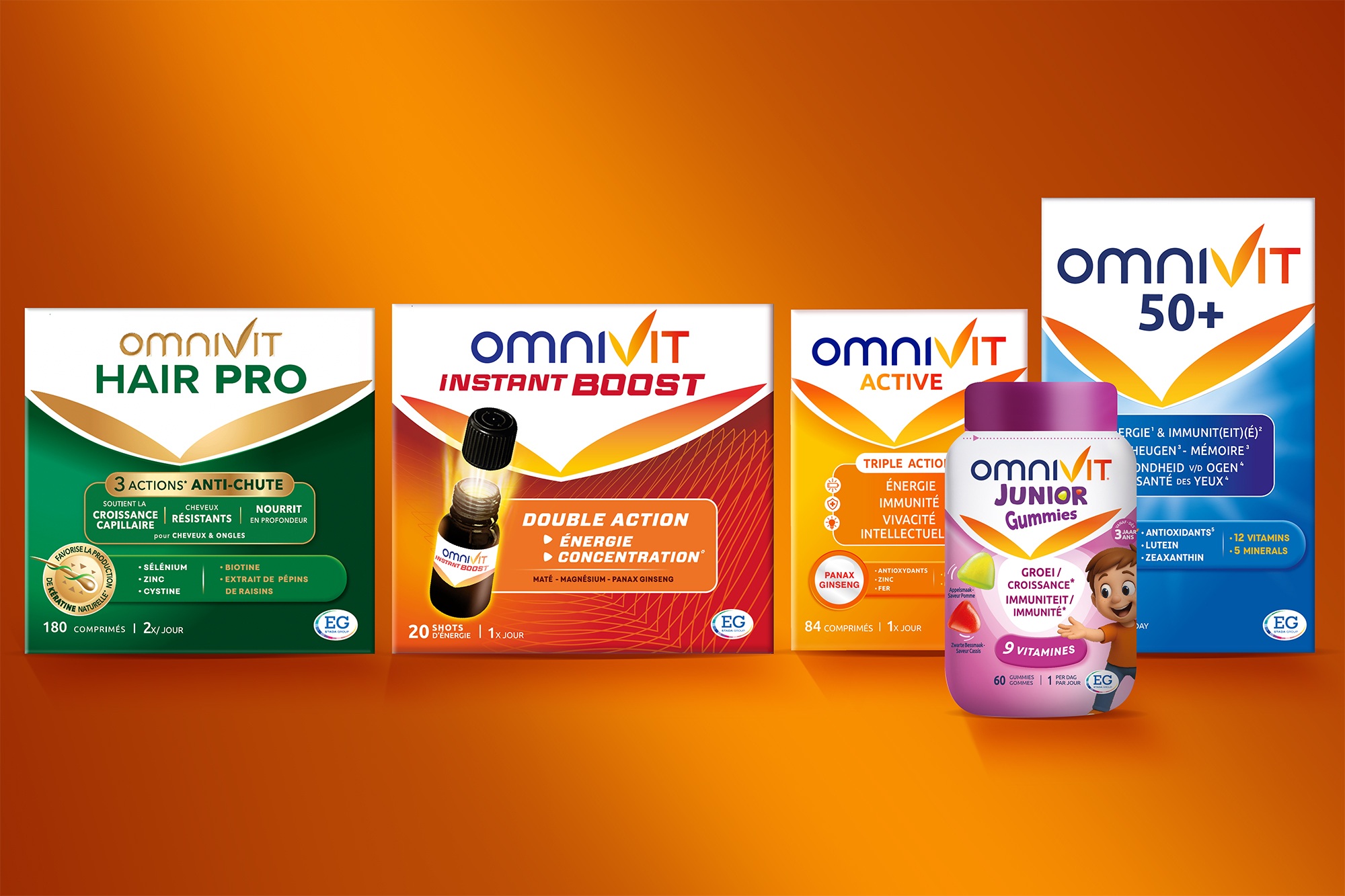
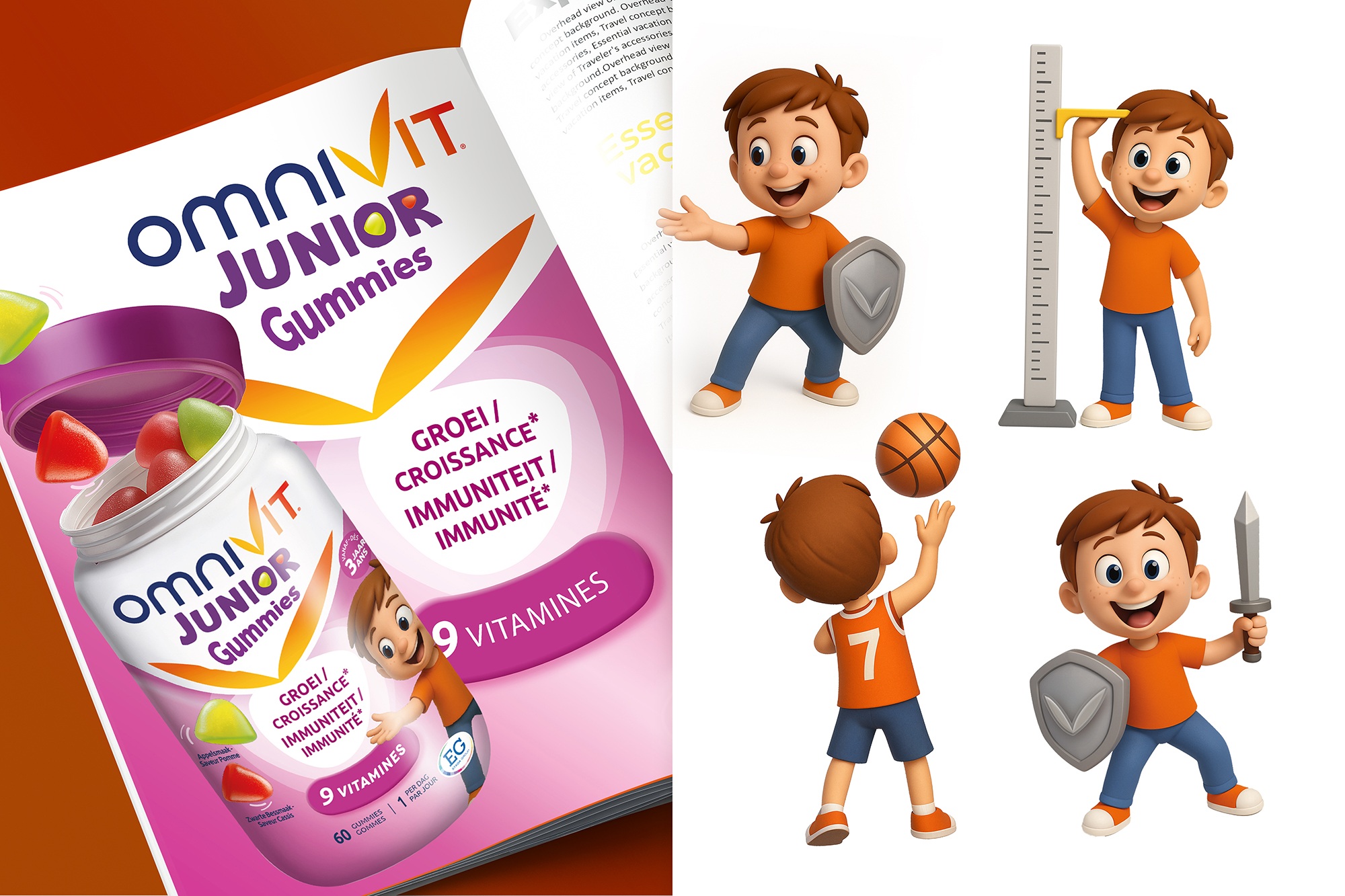
The Omnivit healthcare range was lacking a strong and coherent visual identity across its packaging. At BlueMango Design, we explored different approaches to creating a new brand structure and ultimately came back to a simple and distinctive idea: the V shape already embedded in the Omnivit name, which could also stand for “Vitality”.
The challenge was to develop a flexible system that could work across different packaging formats and sizes, while allowing distinct product categories to maintain their own identity. This was particularly important as the haircare products target a different consumer than the multivitamin range.
We therefore developed a clear portfolio strategy, defining a common visual framework for the brand while giving each category its own distinctive visual identity.
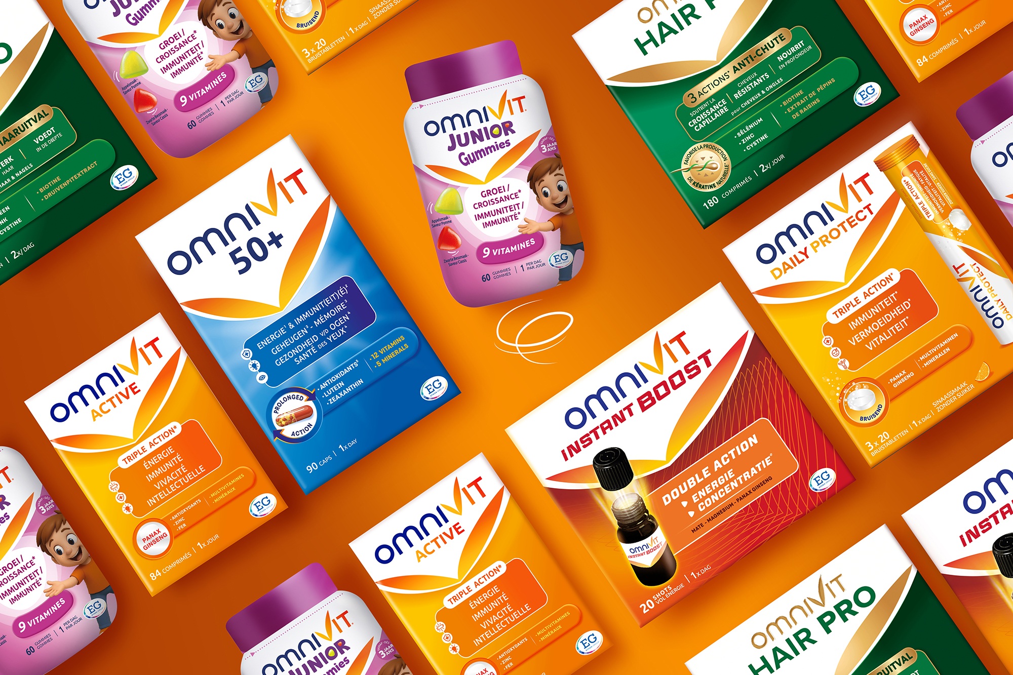
For the Omnivit Junior range, we created a playful new character designed to appeal to children and their parents. The character was developed as a versatile brand asset that could be used not only on packaging, but also across broader communication materials.
A more premium look for the Omnivit Haircare range
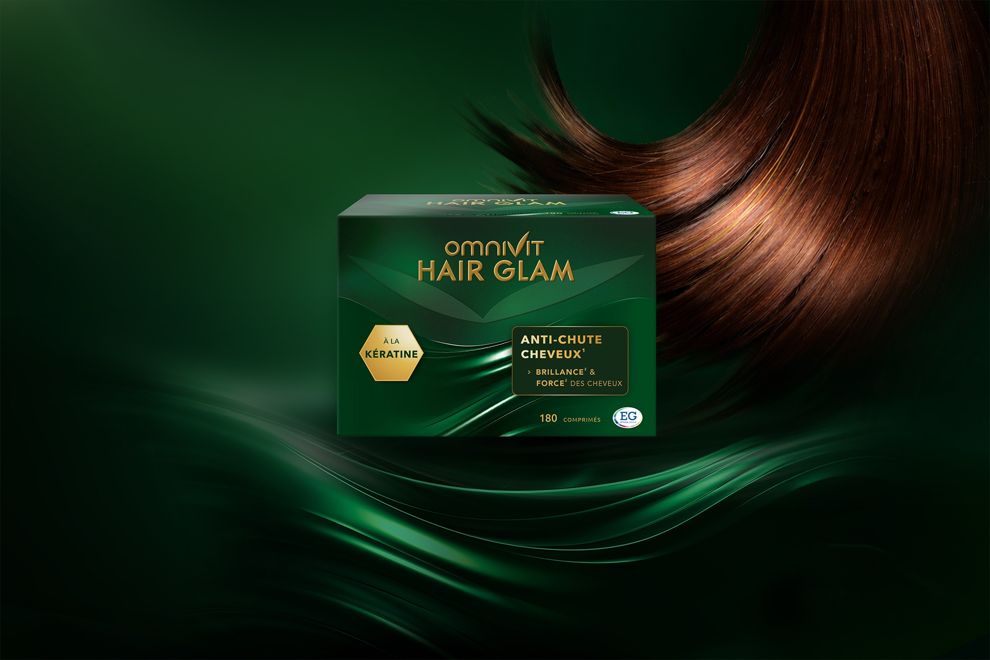
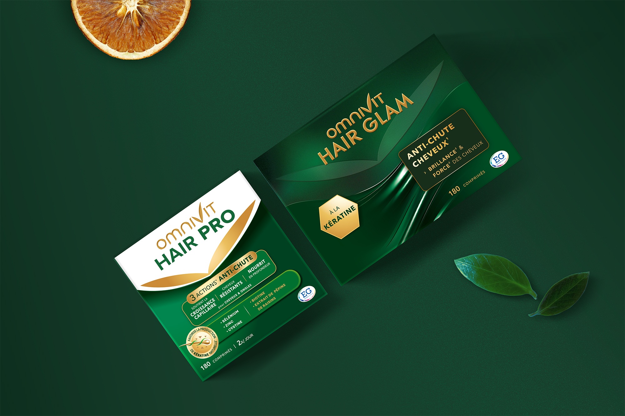
For the Hair Pro and Hair Glam references, we introduced a more premium, cosmetic-inspired colour palette, combining deep green tones with gold hot-foil stamping and spot varnishes.
The distinctive finish gives the ranges stronger shelf presence and helps them stand out from competitors in the category.
Others Projects