The rebranding of the iconic Peterman Jenever range
Peterman Jenever is an institution in Belgium, but its bottle labels were ready for a contemporary update.
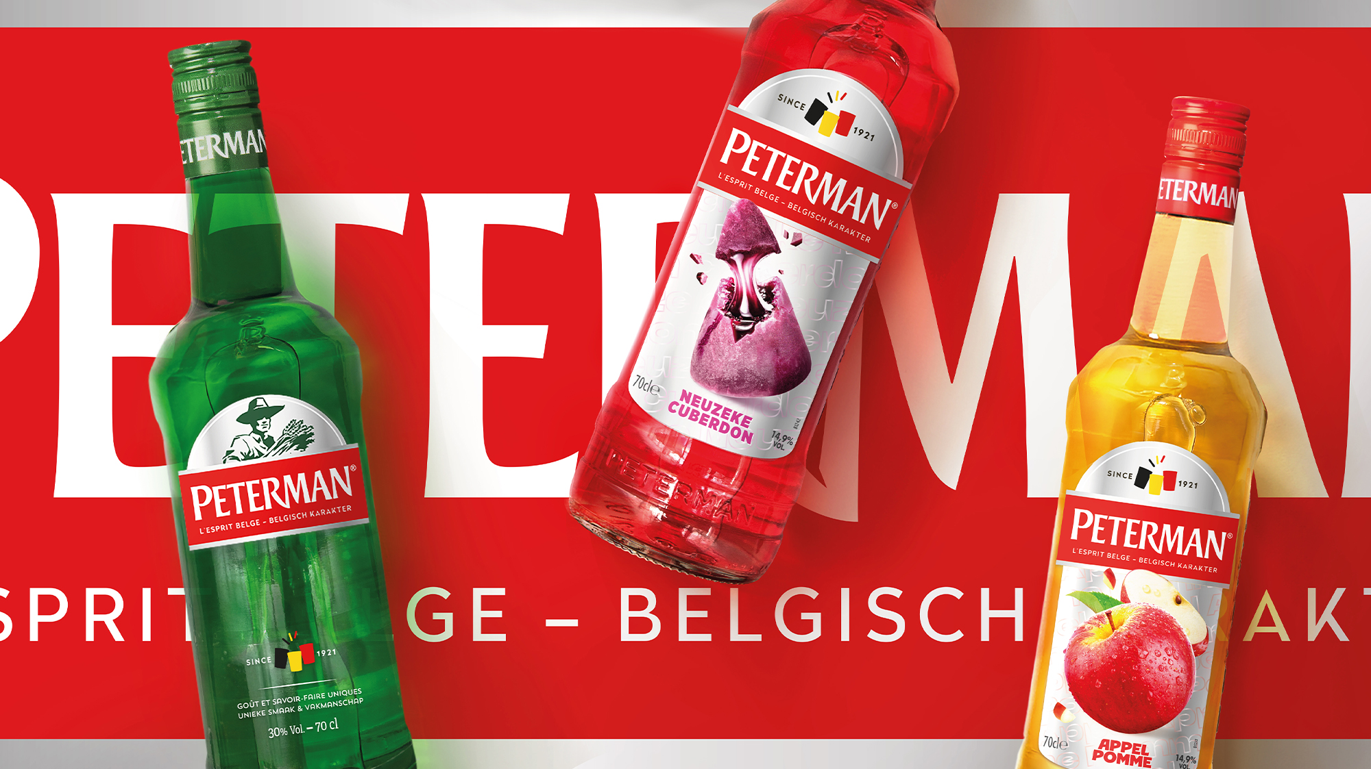
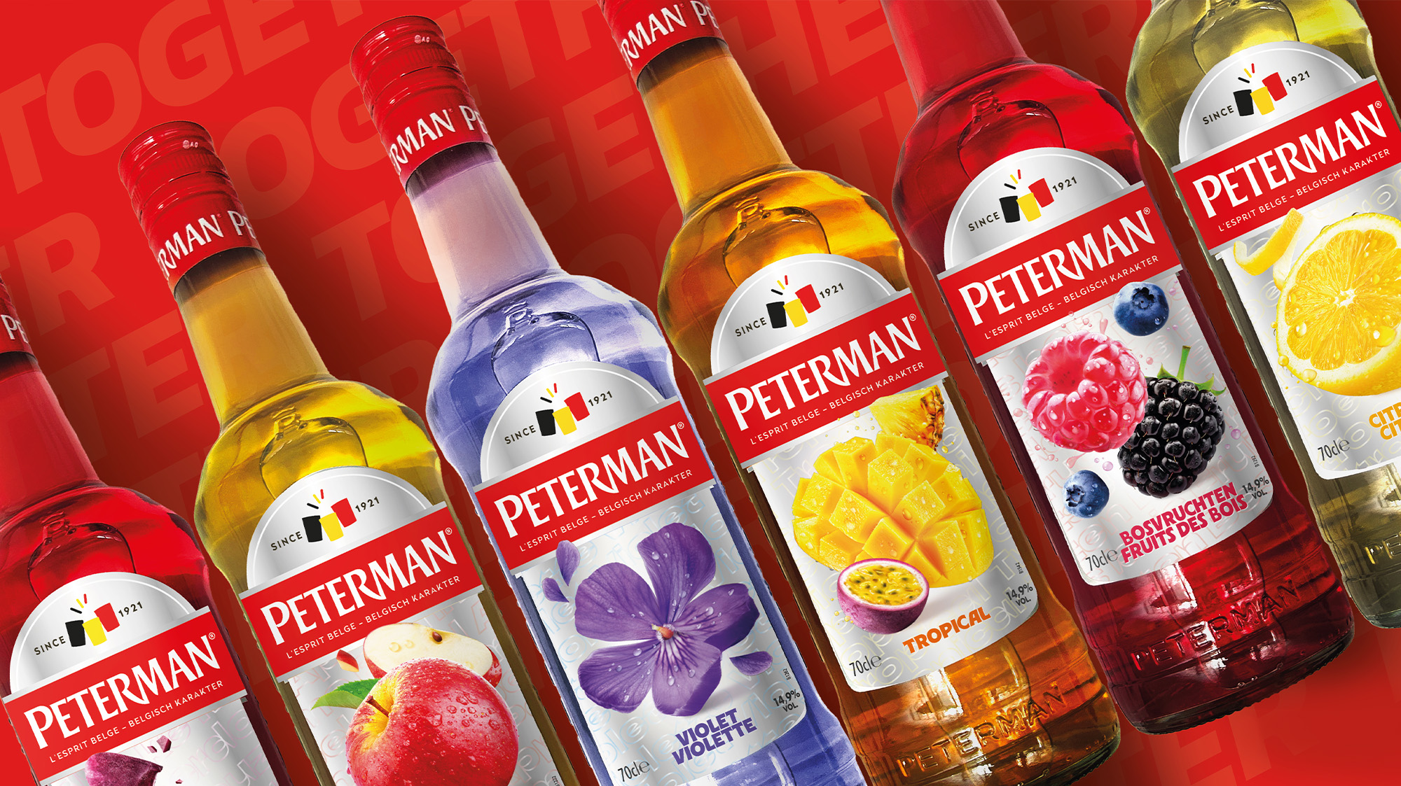
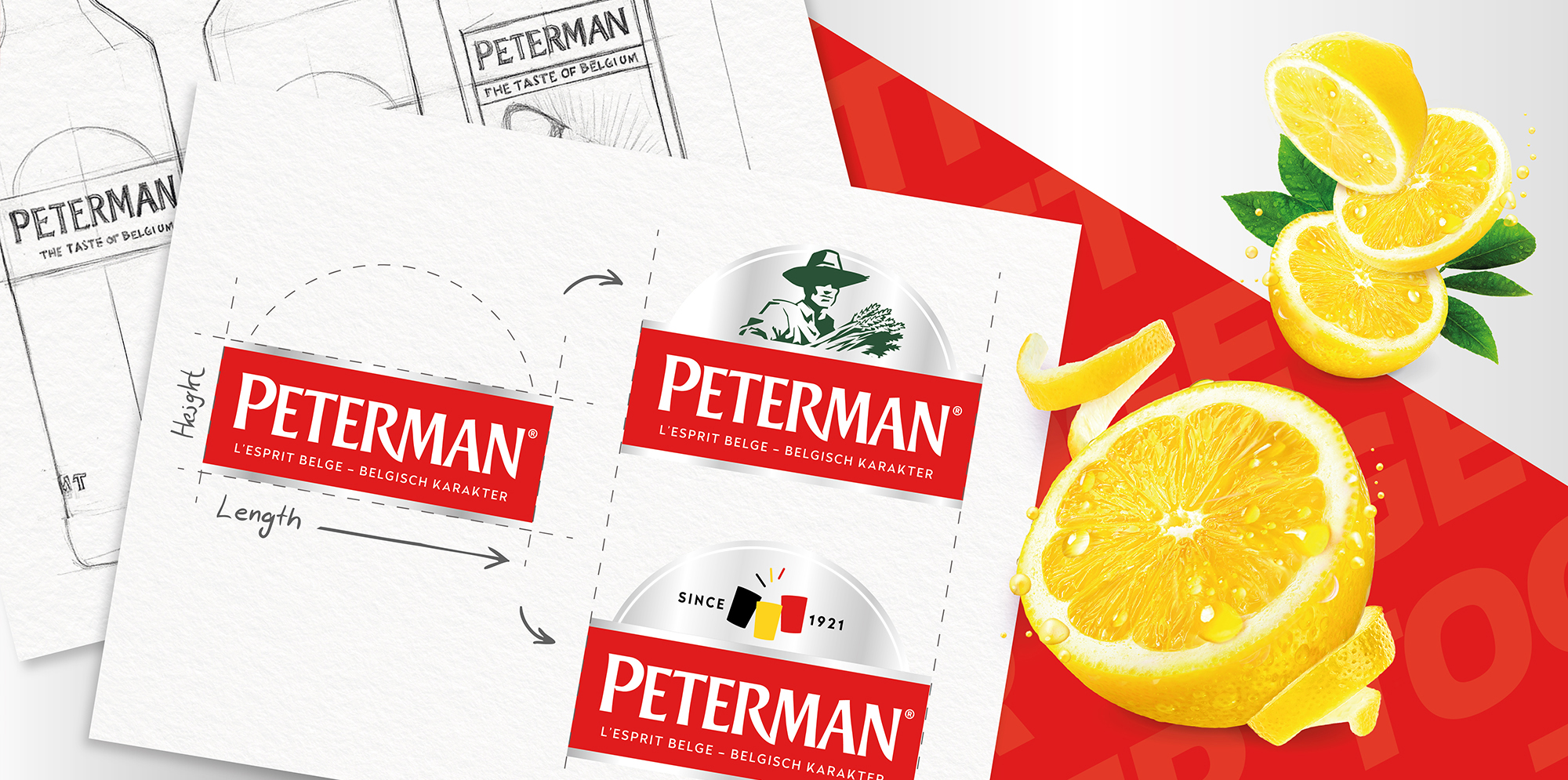
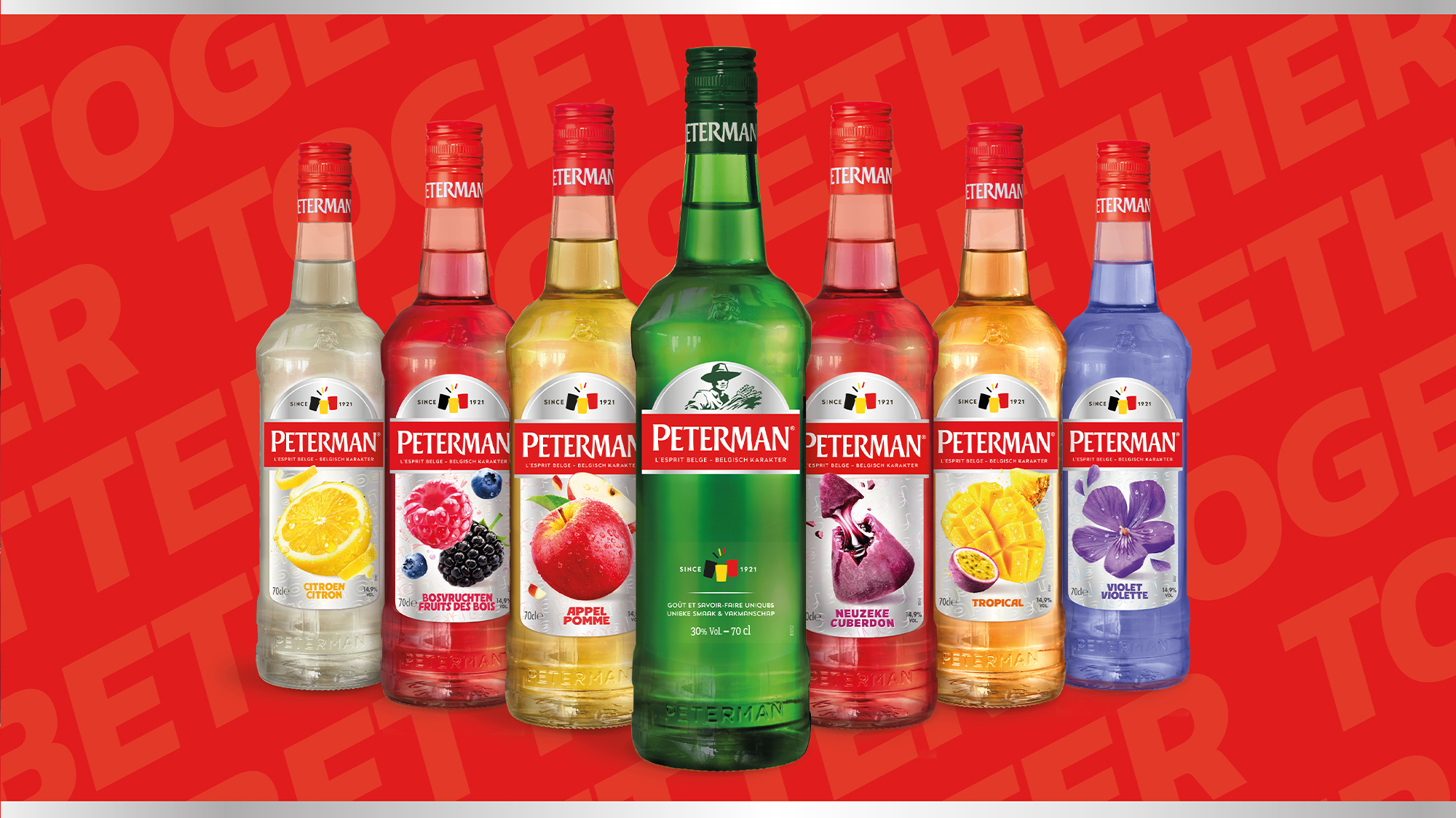
Our design analysis revealed the need to harmonize the branding between the classic and flavored Jenever ranges. To achieve this, we rethought the label shape — moving away from the traditional rectangle to a more distinctive and premium silhouette — and strengthened brand recognition by adding a new baseline.
We also placed the branding at the heart of the design and enhanced the reference to Peterman’s Belgian heritage with a subtle motif: three colored glasses symbolizing the national flag, framed by the distillery’s founding date.
For the flavored Jenever range, we redesigned all visuals to be more vibrant and playful. The contrast between glossy fruit imagery and a matte metallic silver background boosts on-shelf visibility and reinforces the premium positioning of the brand.

Others Projects


