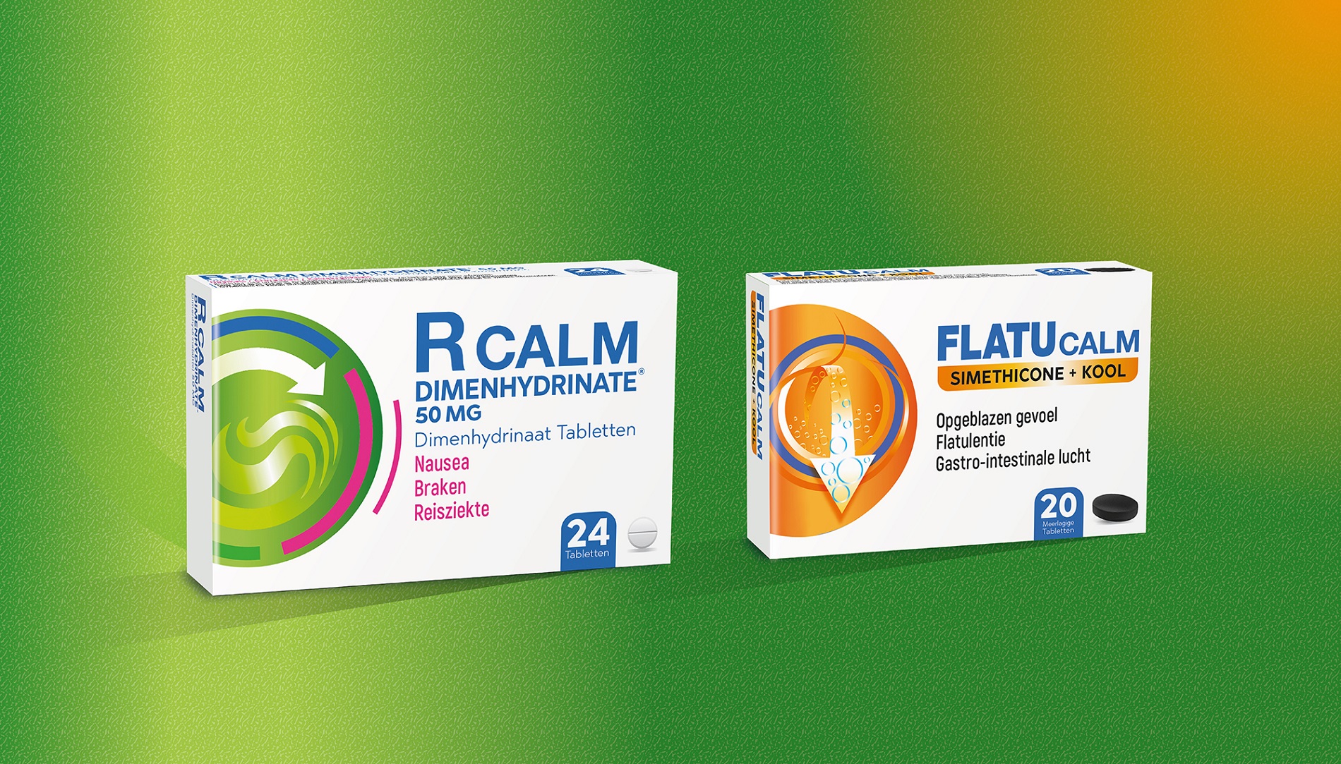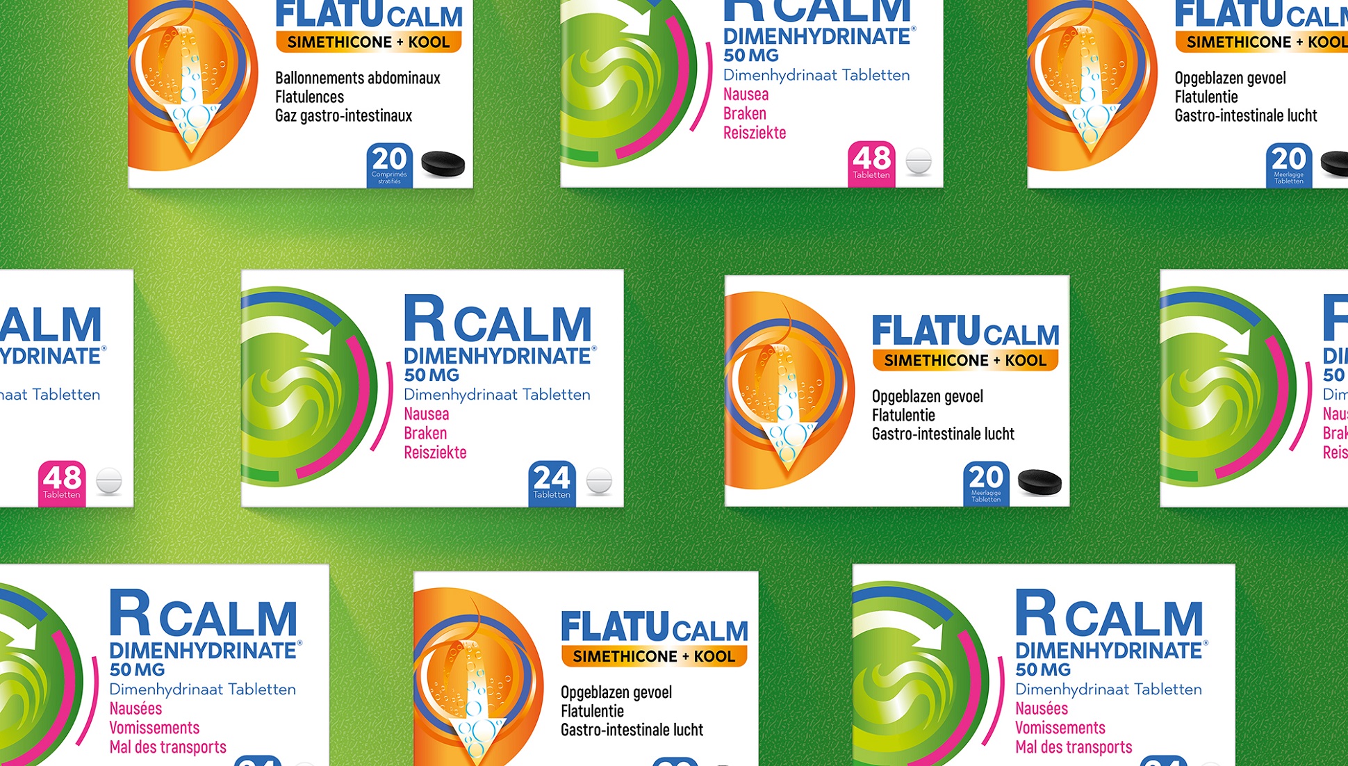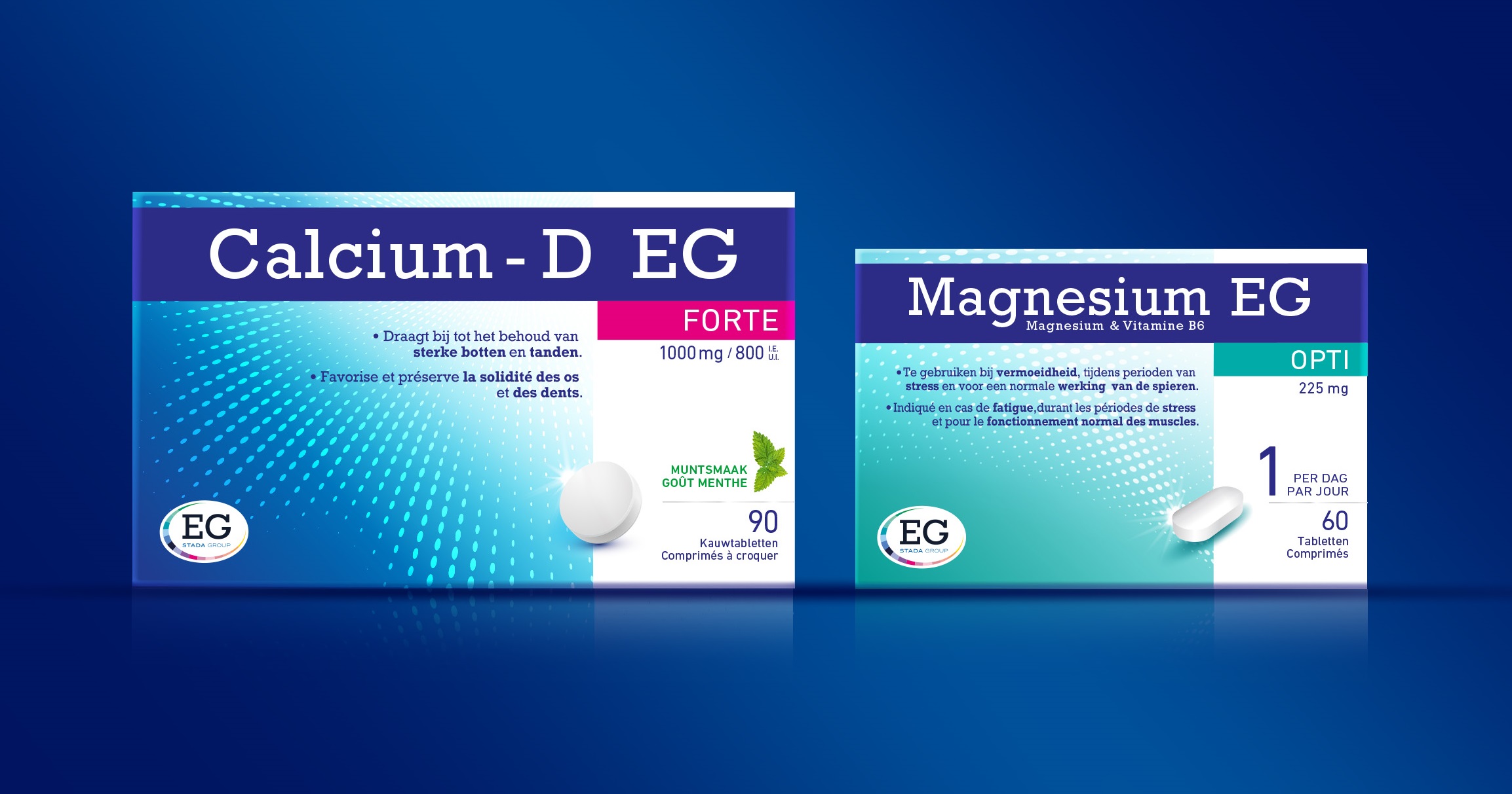
The well-known motion sickness medicine R Calm, sold in Belgium, was up to a modernization of its design. The new design and the roll out of the design structure to other products strongly increased the shelf impact and product promises.
To create a more convincing look-and-feel we based ourselves on the notion that less-is-more and reduced the number of icons previously used on pack.

Others Projects


