From Local Design to International Brand Identity
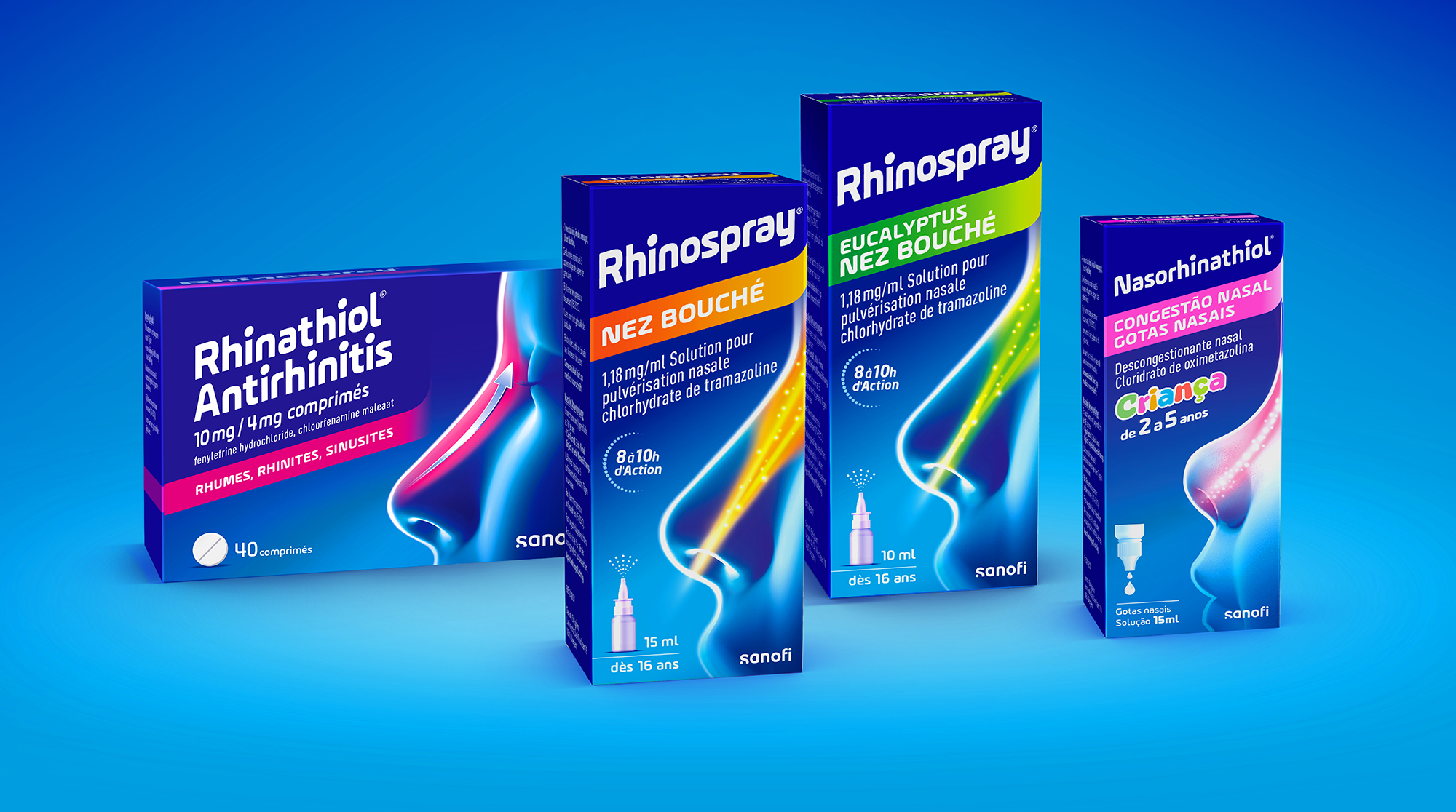
What began as a rebranding mission for a local Sanofi respiratory healthcare brand evolved into the creation of a new international brand identity—now used in countries like Belgium, Portugal, Hungary, and Austria.
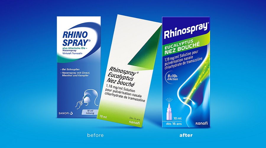
Through strategic persuasion we demonstrated the potential of our new Rhinospray design to replace the varying local designs across multiple markets, creating a cohesive and unified brand identity under the same name.
We understand the power of distinctive colors and simplified graphics in making a brand stand out on the shelf, ensuring recognition and recall. Rather than relying on the conventional white background, we introduced a bold gradient—from deep purple-blue to cyan—creating a striking visual presence.
To further enhance brand recognition, we designed a sleek nose and face illustration on the right side of the packaging, incorporating colored sprays or arrows to communicate each product’s specific benefits.
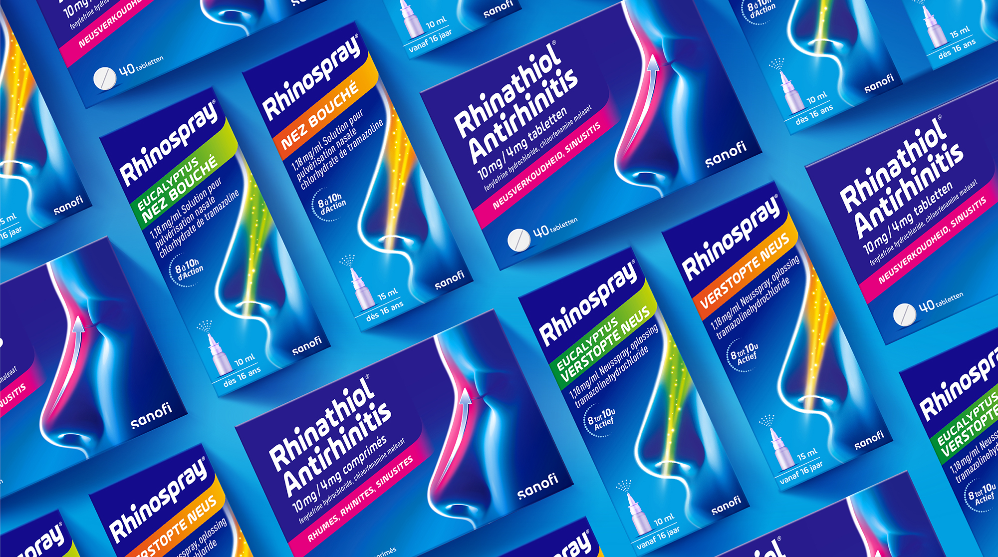
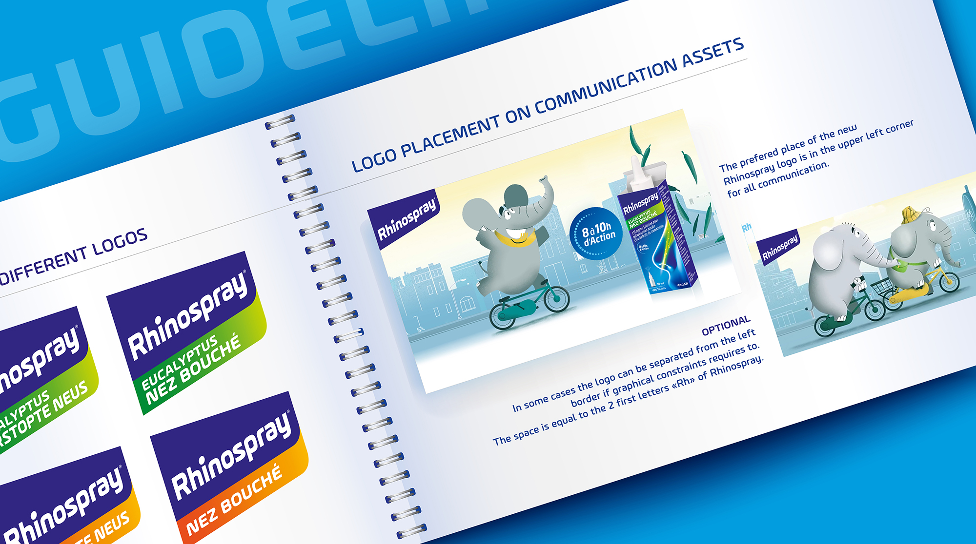
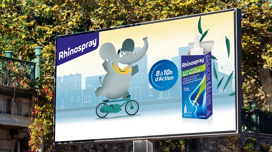
A new brand identity also meant developing a comprehensive guidebook to ensure consistent usage across various touchpoints, whether for communication materials or point-of-sale activation.

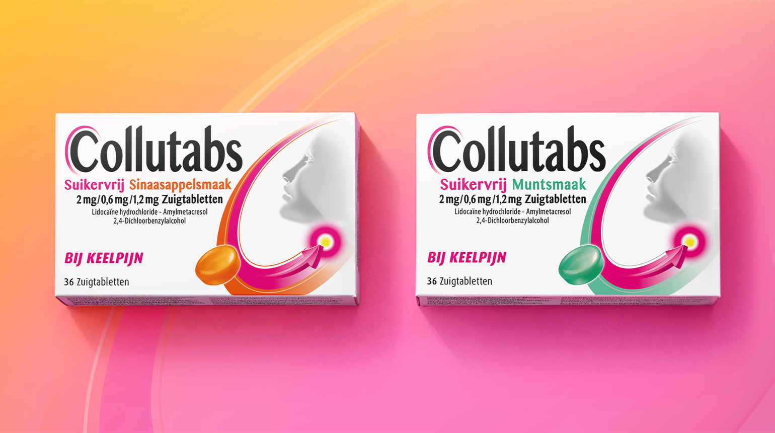
Others Projects