Aïki rebranding
We performed a full redesign of the popular Aïki brand, often referred as “Aïki Noodles” by young consumers.
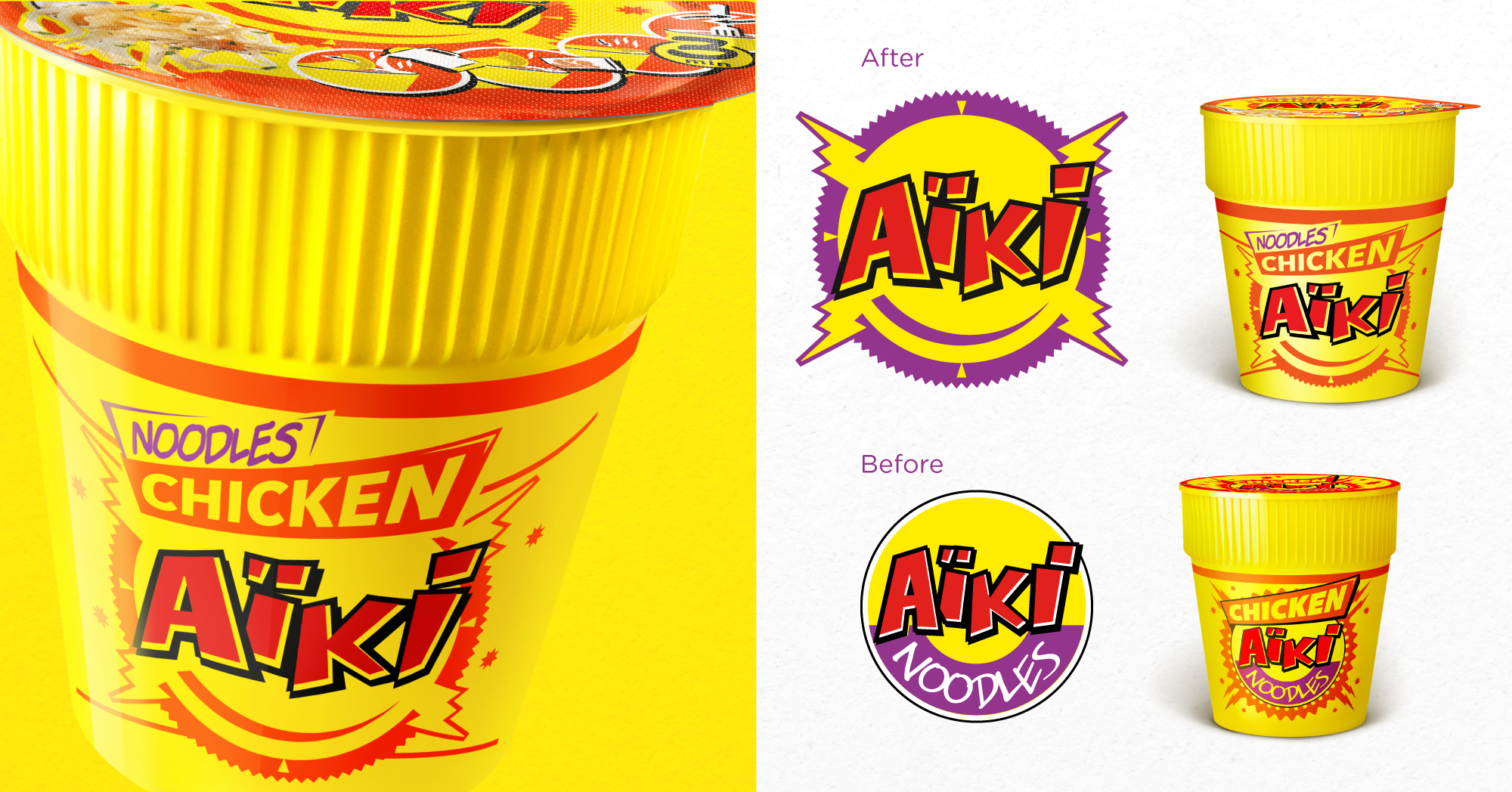
In order to provoke this somewhat restrictive mindset to evolve and allowing future product extensions, we insisted on graphically liberating the Aïki logo from its category denominator.
As a result, the typography of the logo acquires the necessary breathing space, allowing the Aïki-name to really stand out and really appeal to consumers as a dynamic and energetic brand.
Furthermore we modernized the overall graphic style of the logo, introducing a more visible brand form, representing a volume button or even a smiley, knowing that Aïki was also often present at a wide variety of music festivals.
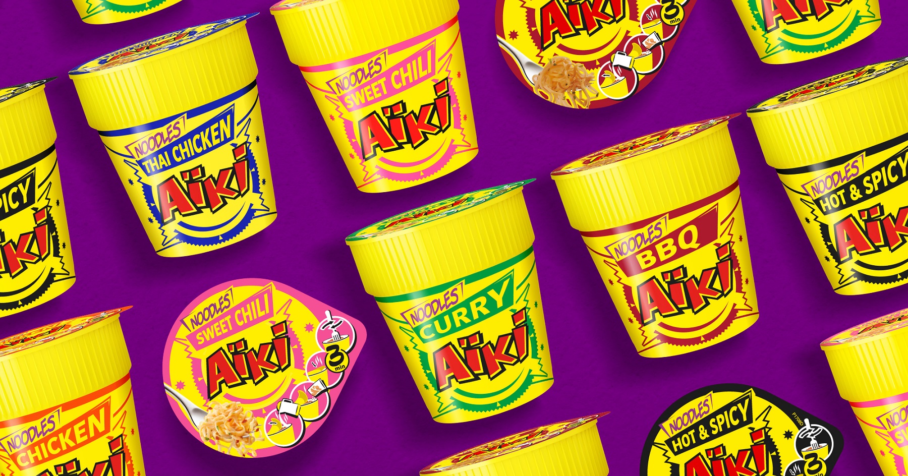
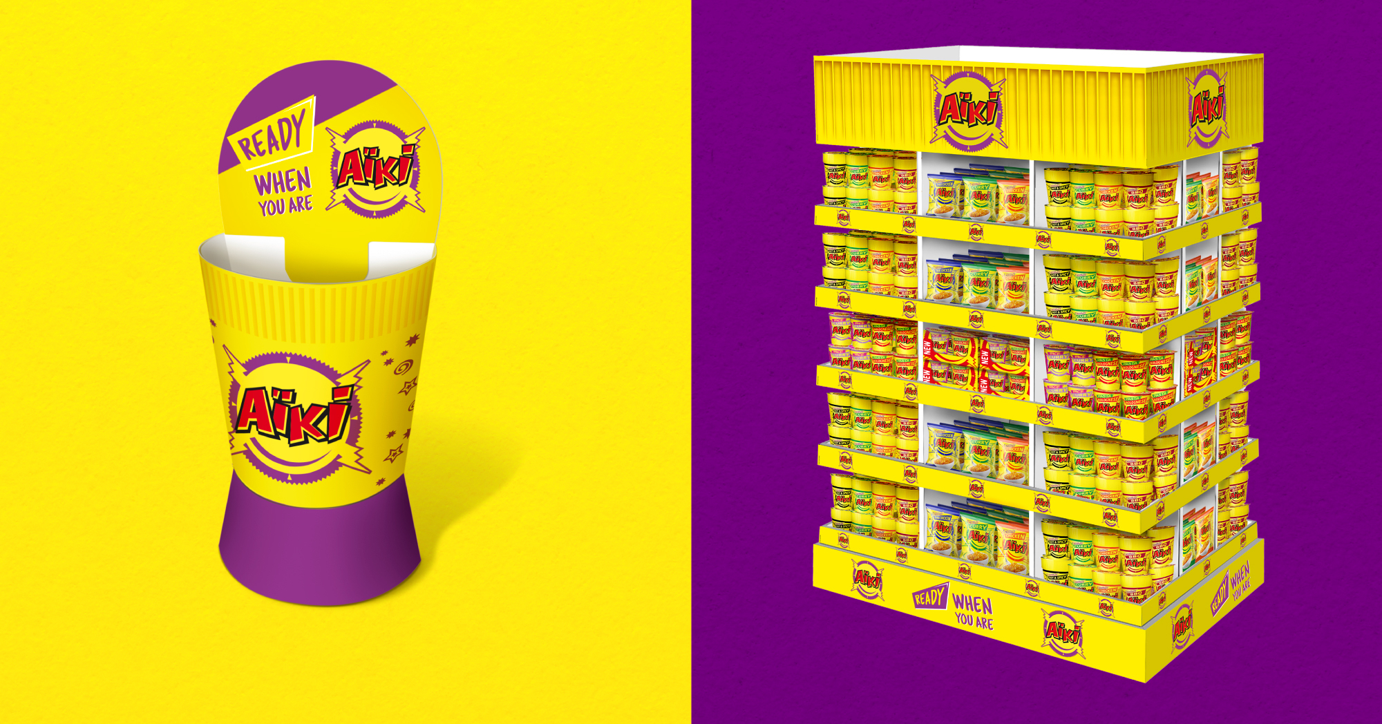
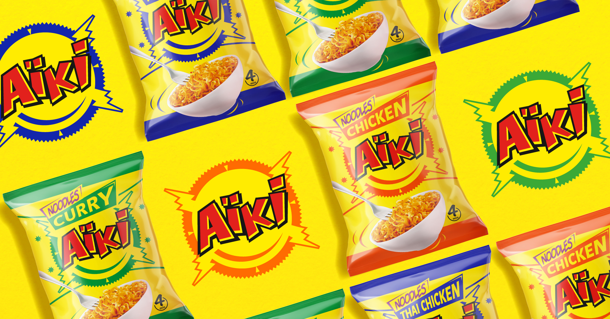
We translated the renewed Aïki brand to its well-known instant noodle packaging, developing the complete range of cups and pouches.
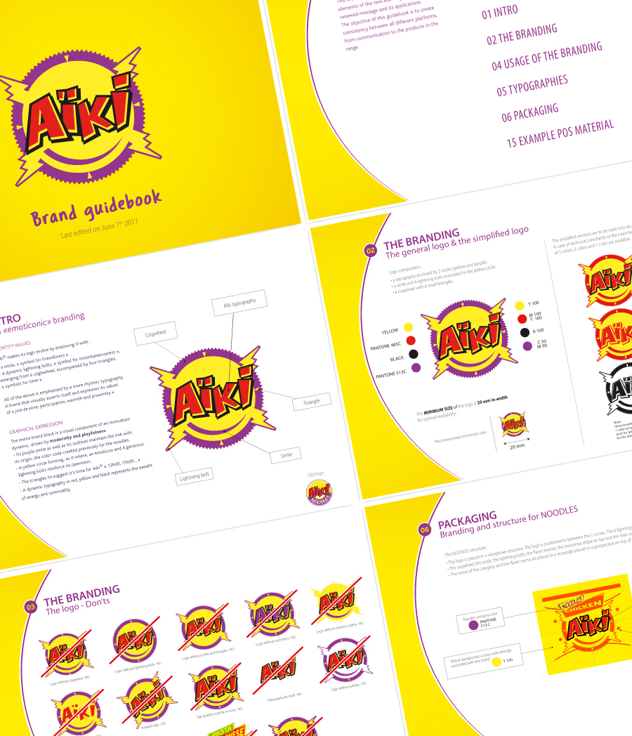
Developing a new logo to reinforce a brand positioning implies the need for consistent branding application. We developed a brand book to pin down some key guidelines, concerning the use of the logo, as well as other graphic brand elements that we introduced.
Last but not least, we designed an array of point-of-sale material (displays, wobblers and totems…) to mark the occasion of a great Belgian brand standing out once again.
Others Projects