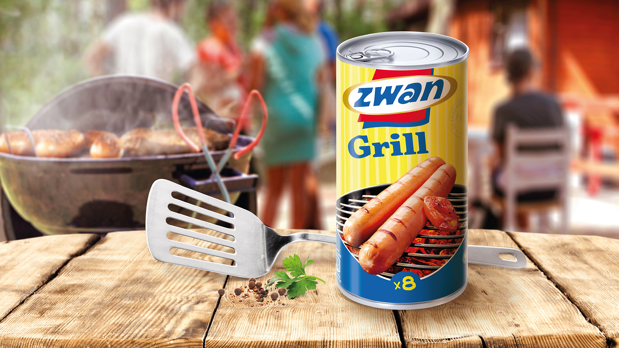
A Zwantastic design, tastier and more attractive. Let’s Zwan
Our challenge for Zwan new identity was to modernize and energize a brand with a strong heritage and credibility of easy snacking.
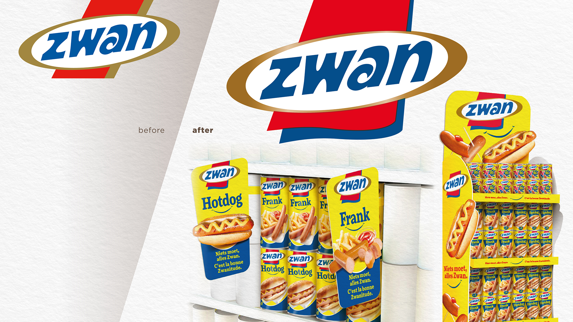
New logo, new look, we had to increase attractiveness while staying true to the strong spontaneous brand image.
The Zwan branding needed a refresh and we slightly adapted the logo and made it more dynamic with a wave banner behind the brand name. The blue and the red of the new logo endorses the brand name with even more enthusiasm.
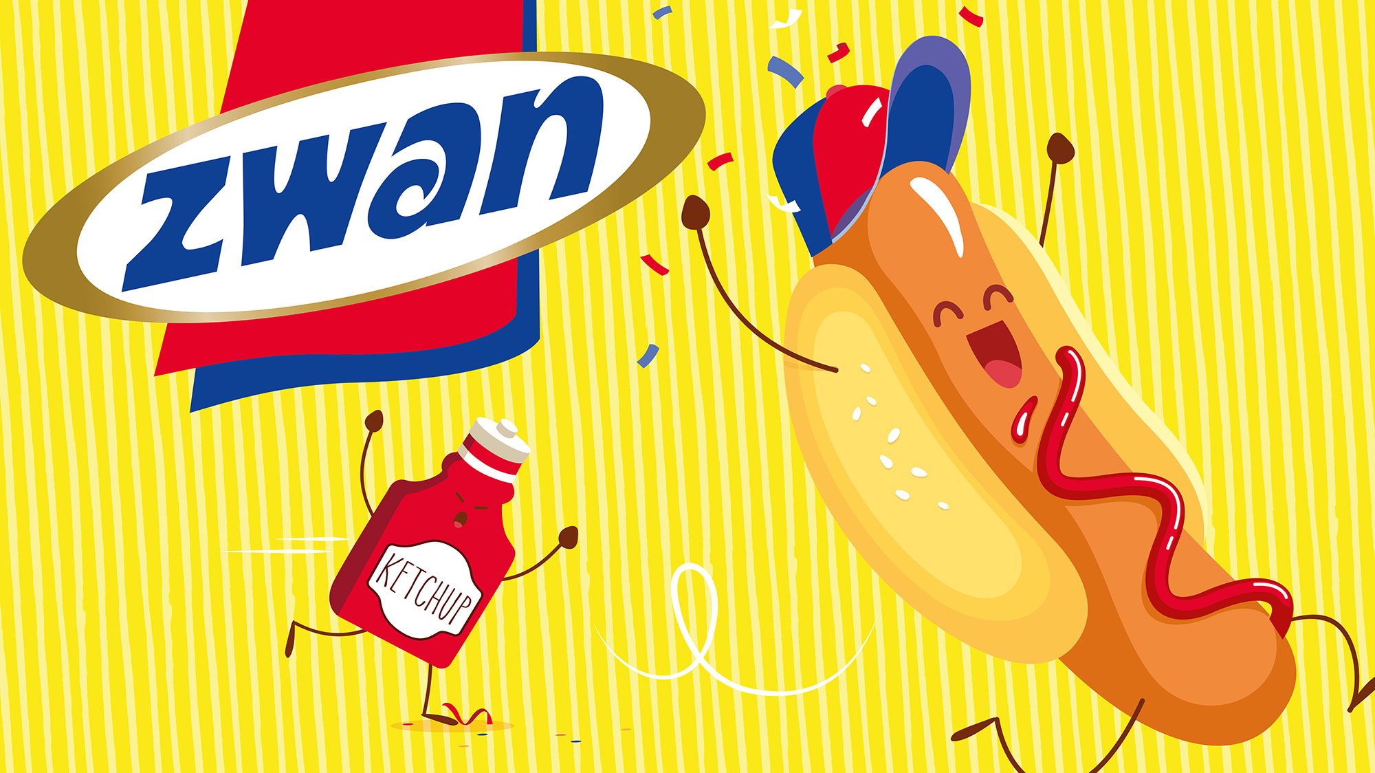
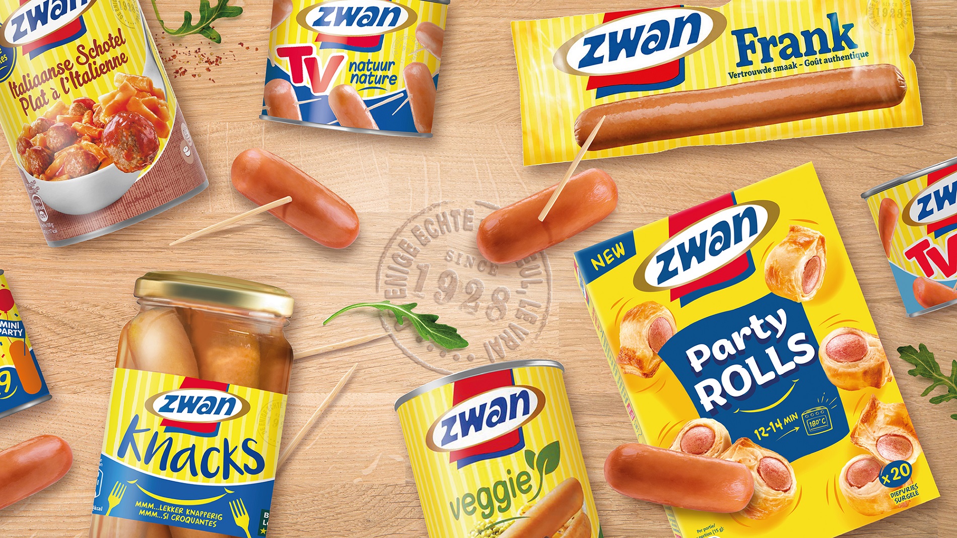
Regarding the packaging design we maintained the presence of the yellow color, that encaptures the essence of Zwan, a color that stands for the warmth and playfulness of the brand.
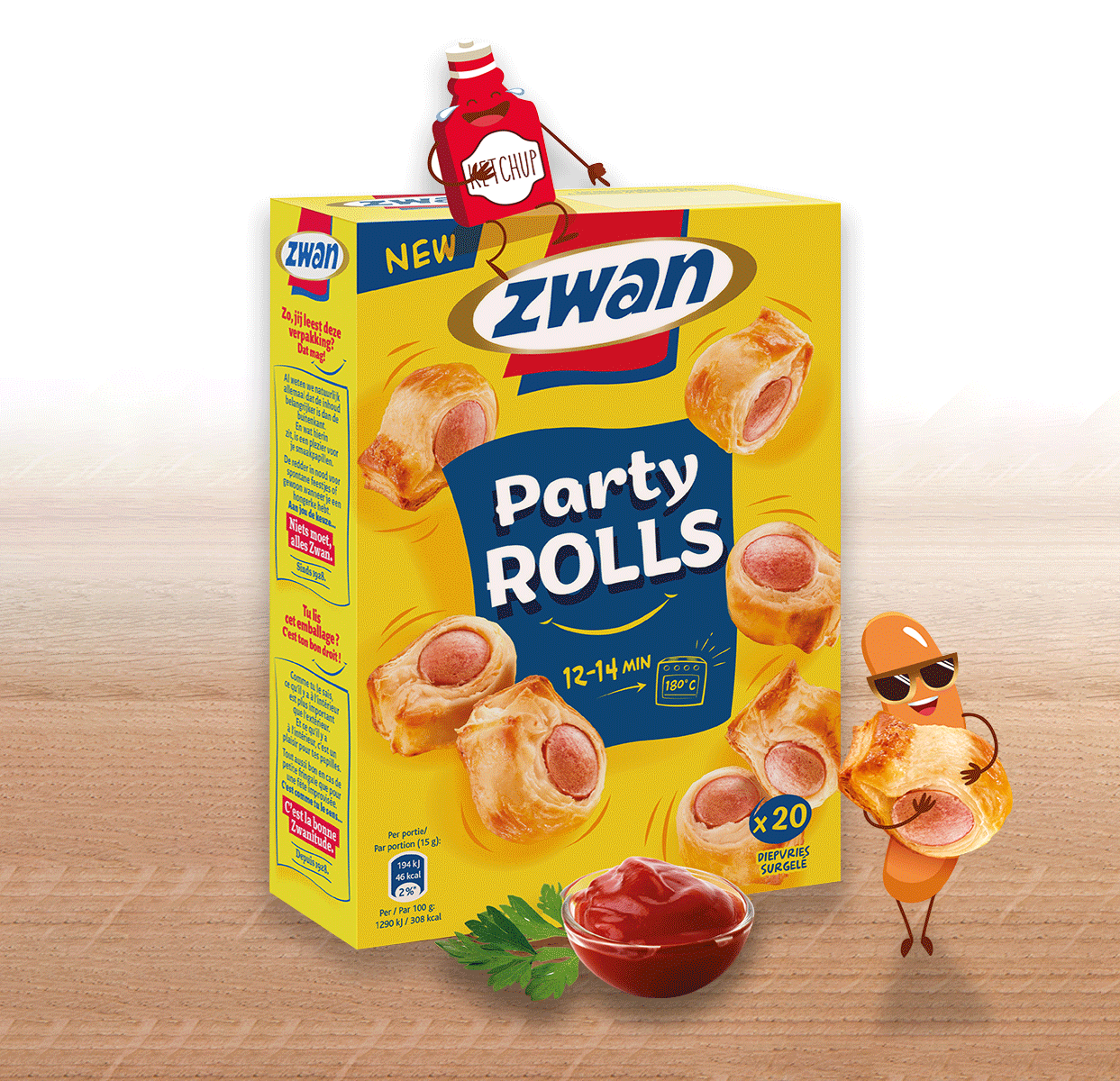
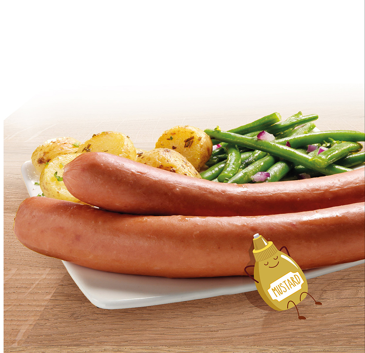
We performed new products shootings to give a tastier look at the range which is essential in order to increase purchase for this kind of meat products often in competition with private label brands.
For more spontaneity and a functional relevance, BlueMango also changed the range colours to better stand out on shelf. It now, allows a quick and easily recognizable choice in the range.
For this new design, key concepts were modernity, freshness and attractiveness: a perfect association to re-connect with today’s consumers while building on the strong credibility and heritage of Zwan.
Others Projects