The revival of seduction
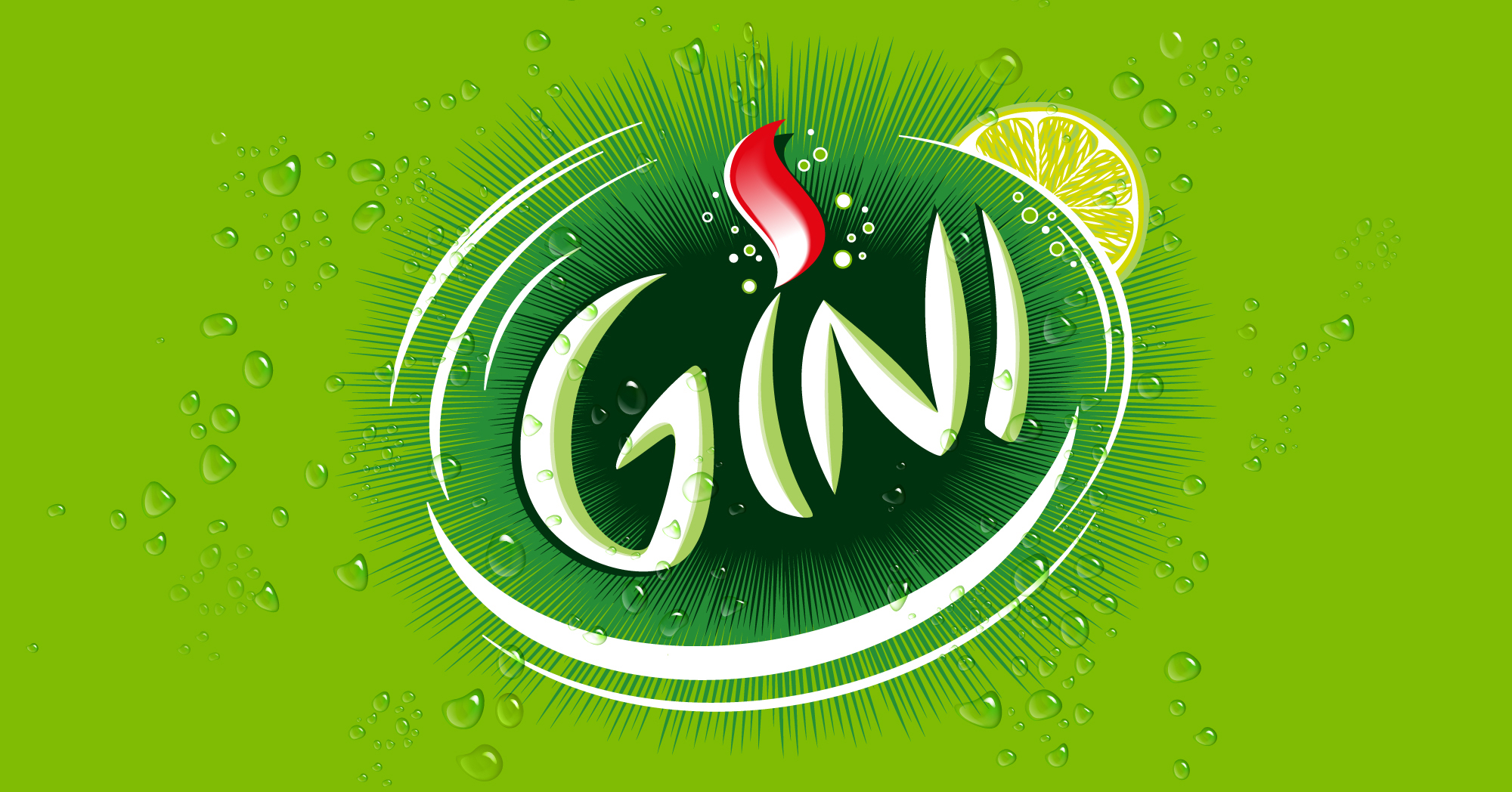
Gini is a quinine based drink, part of the Suntory Beverage group and a brand founded on a seductive and passionate identity since more than 40 years. Our analysis threw a light on an attenuated vibrancy, reflected in the brand’s logo and packaging. So we got to work!
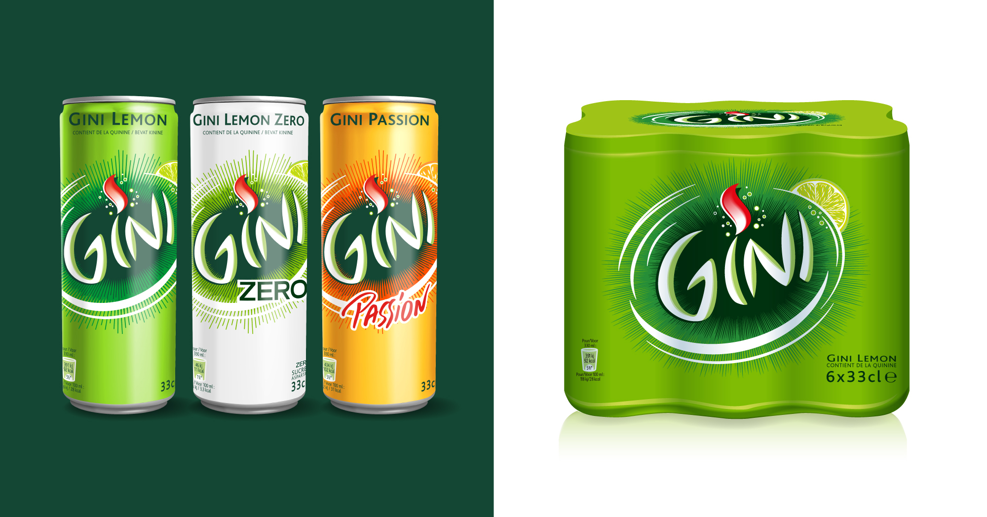
Our first objective was to resurrect a powerful and unrestrained impact. We therefore refined the logo by removing complex, superfluous graphic elements. We centered the Gini logotype on an explosive background and finally surrounded it with an eye-catching white swirl.
Secondly we aimed to bring back coherence to the packaging range in terms of the logo’s orientation, avoiding the use of diverse angles like on the old range.
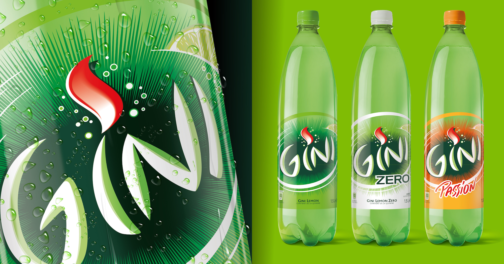
The Gini-mission withheld quite a few technical complexities due to the variety of packaging materials: from metal cans, to paper labels, to transparent plastic labels and finally also plastic shrinks used for the multi-packs. We tackled these challenges with a lot of enthusiasm by testing, finetuning and creating real-life mockups.
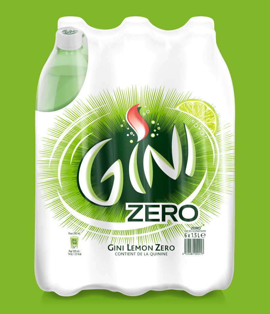
Another challenge was to translate the design choices to the sugarless and orange based Gini references. We aimed to optimize the presence of a differentiating background color, which was especially necessary for the transparent plastic labels used on the 1.5L bottles. For the Gini Zero reference, we switched from a silver-gray color base to a fresher white one.
Others Projects