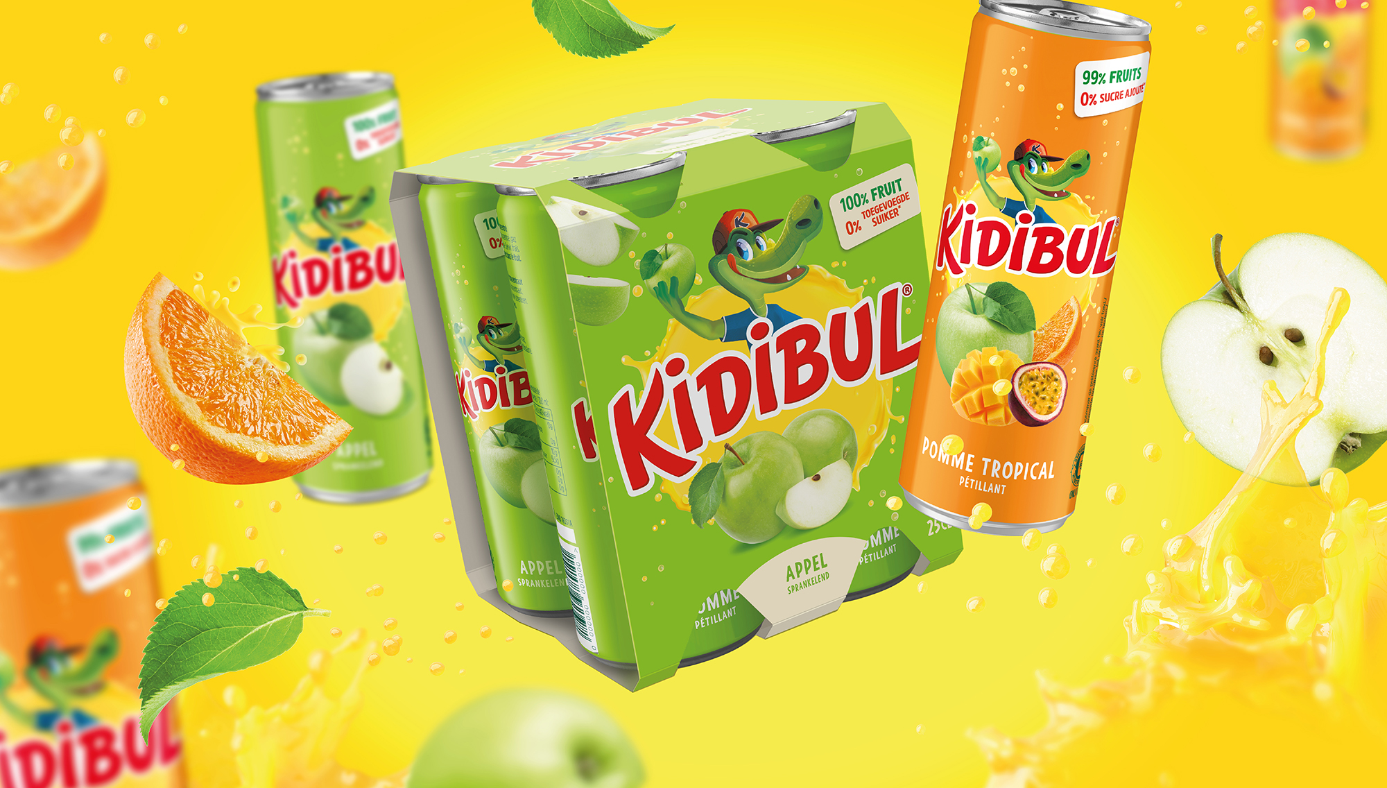
Kidibul rebranding based on new positioning
We had the privilege of rebranding the famous Kidibul brand, sold throughout Europe and currently owned by the “La Martiniquaise Group”. This significant global mission began with defining a new brand positioning that would help increase distribution, attract a broader audience, and be legally future proof.
Kidibul is a carbonated juice drink with apple juice as the primary ingredient. The Kidibul beverage is completely natural, with only vitamin C and carbon dioxide added.
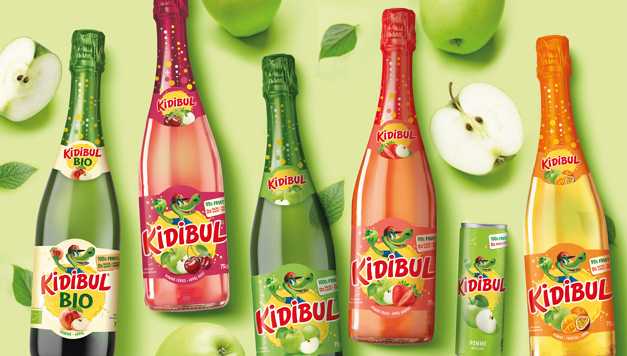
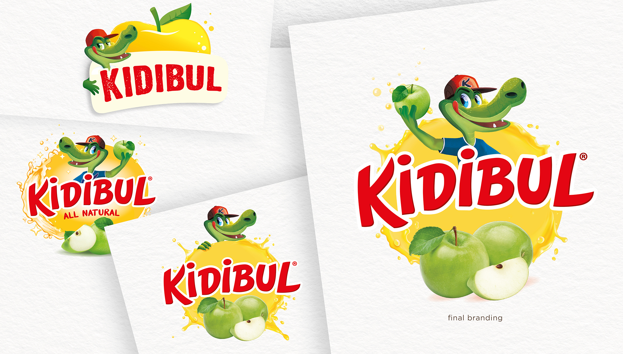
During our creative process, our goal was to enhance the brand’s healthy perception and highlight that the range includes different flavors besides the 100% apple juice.
To achieve this, we adjusted the proportions between the fruit images, the branding, and the crocodile illustration. The use of softer colors instead of bright colors also enhances the healthy perception.
The Kidibul product range offers juices in 75cl glass bottles as well as 25cl slim cans. Specifically for the cans, we had to move away from the previous “candy” style design, which was not very reassuring for mothers, and create a new design that could compete with Capri-Sun, Oasis, or even Fanta.
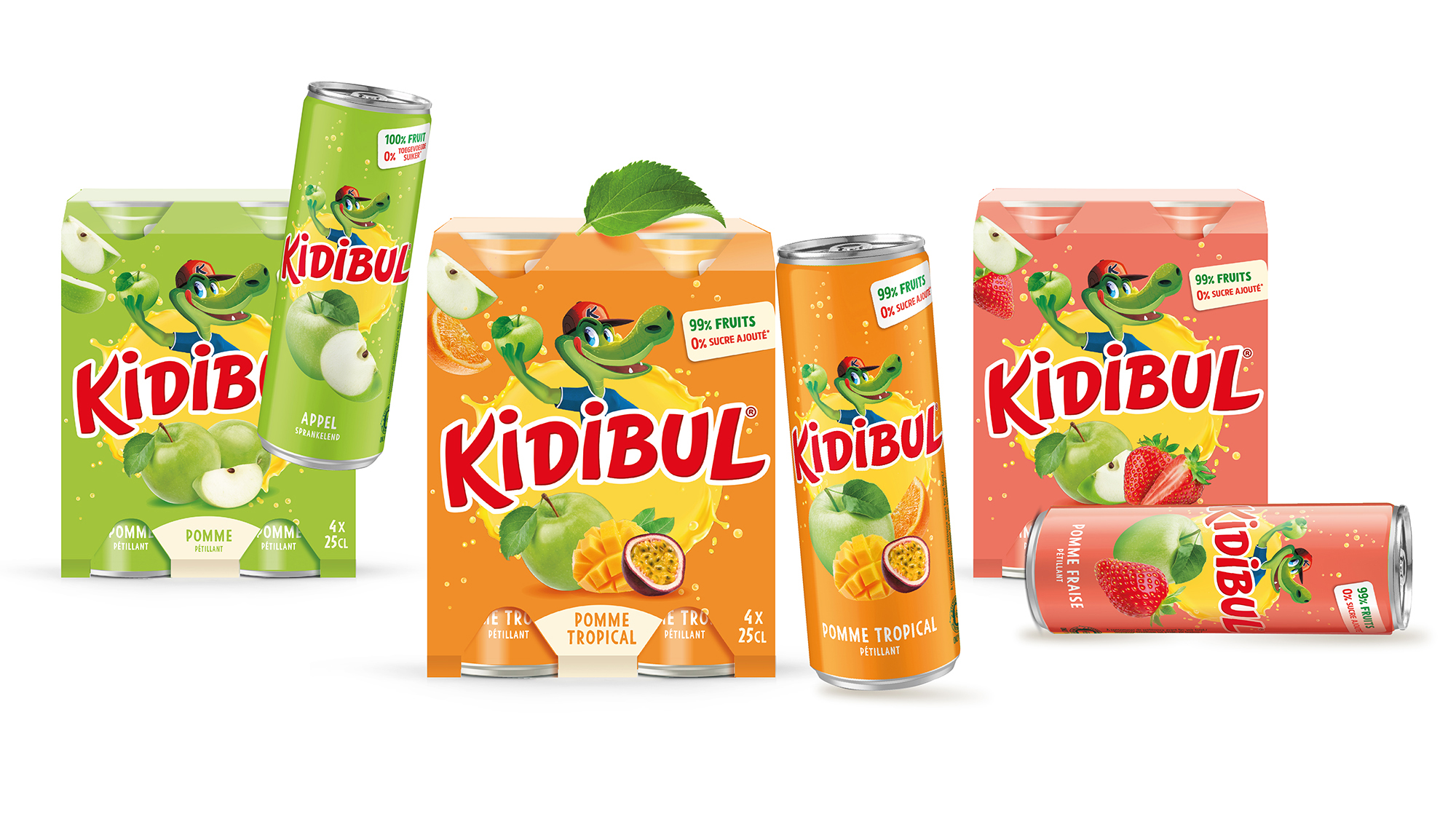
We spent a lot of time defining and creating new background colors for each flavor and discussing with all production partners in Europe, who are responsible for producing the bottle labels, aluminum cans, and bottle foil capsules, on how to achieve a harmonized output for each medium.
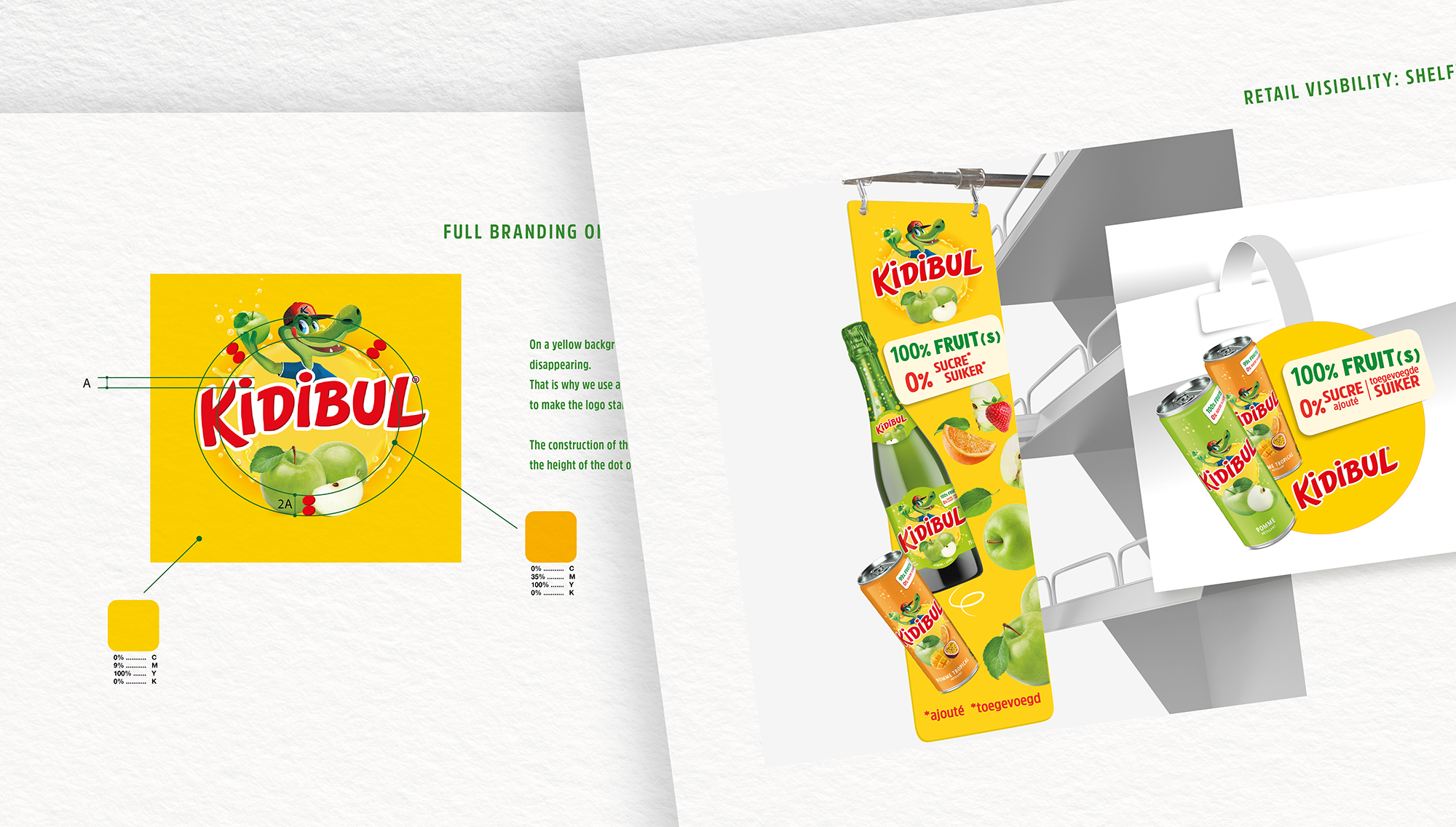
It was also necessary to develop a new brand guidebook to be used by the different countries for the creation of new advertising and promotional materials.
And last but not least, we adapted the bottle labels into different language versions tailored to the various market clusters.
Others Projects