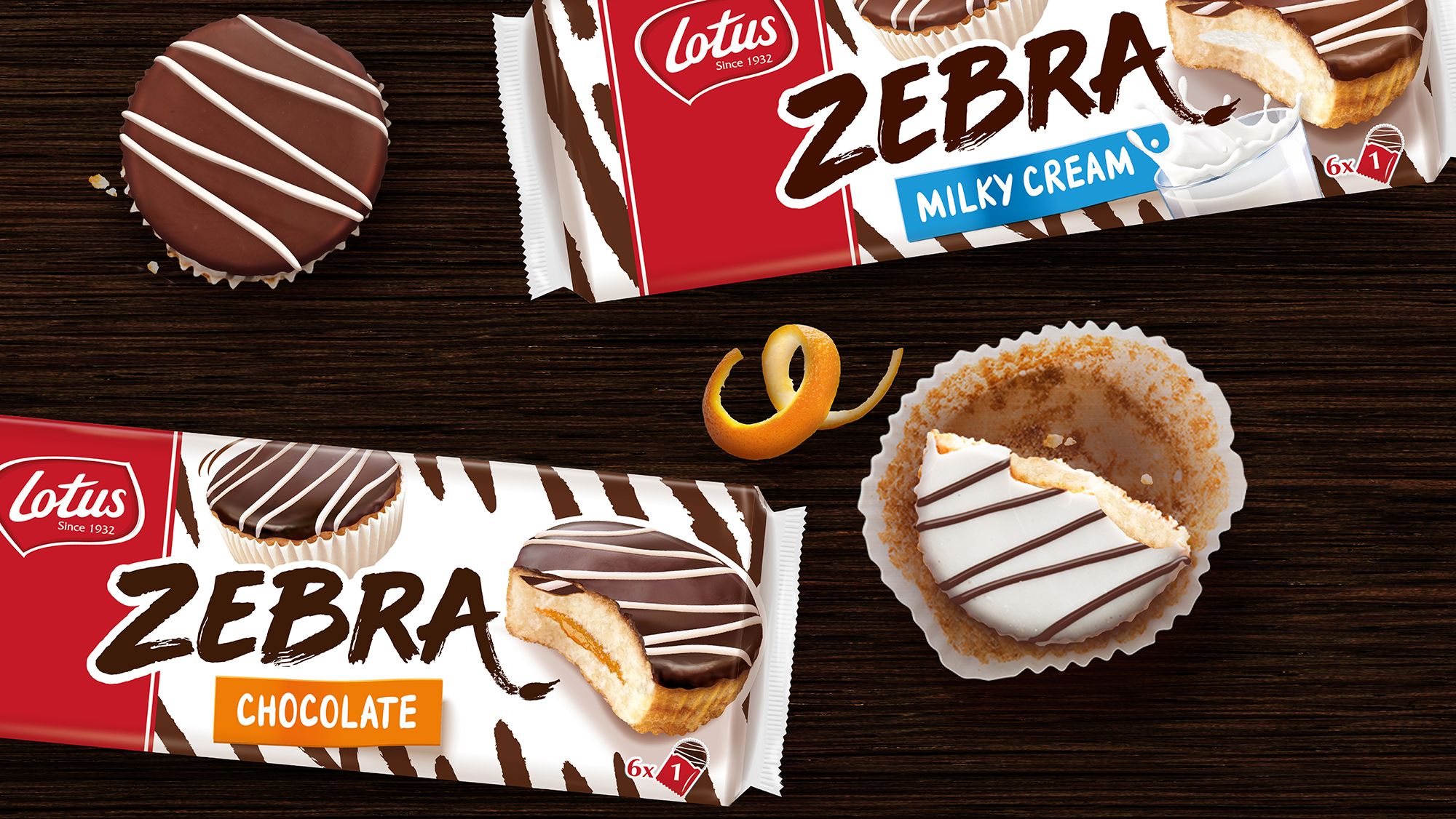
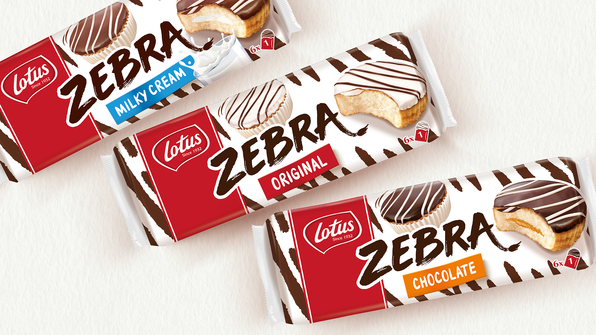
Revealing the true Zebra-stripes
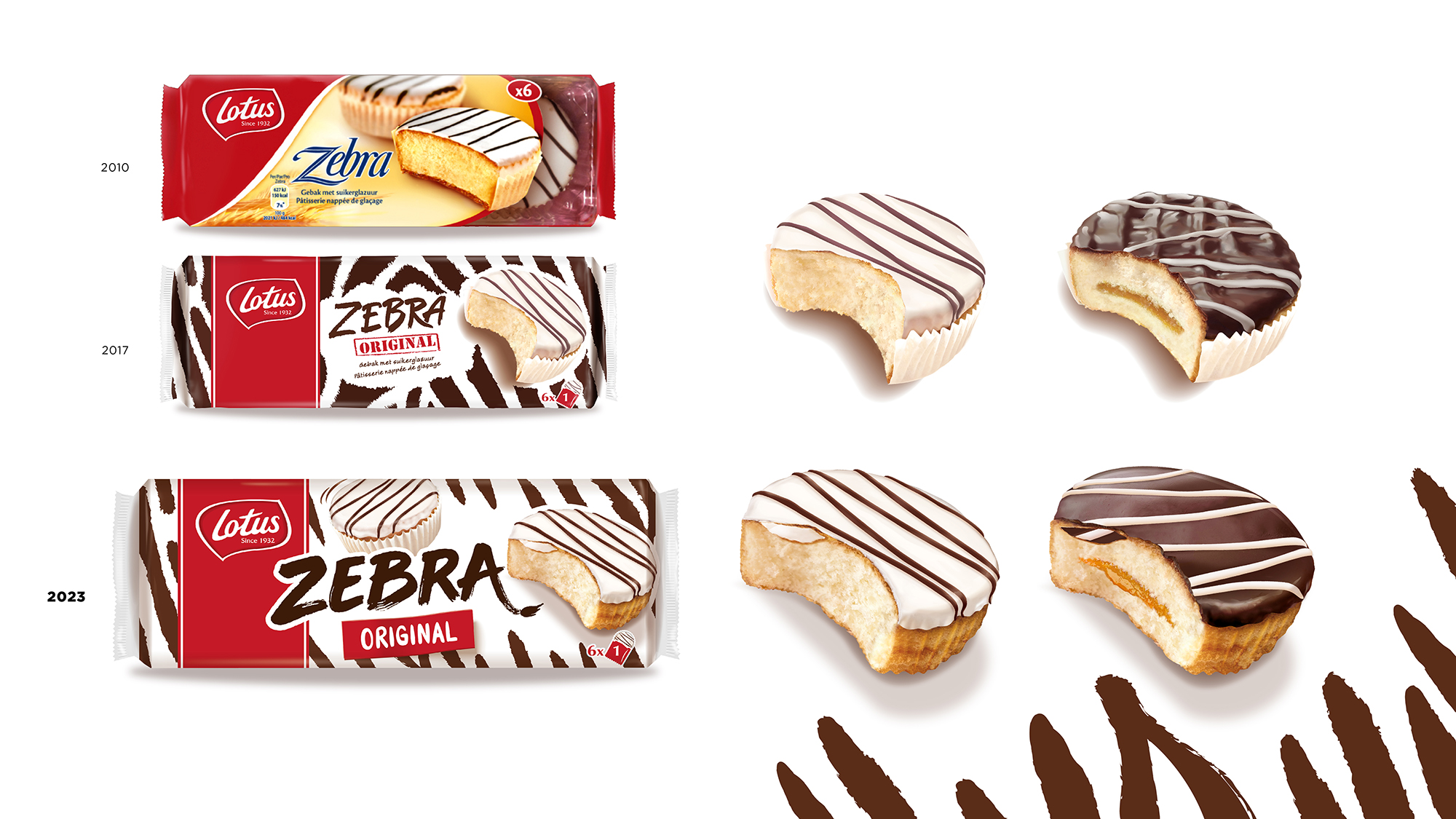
We were asked to undertake the design evolution of the Lotus Zebra range. The goal was to increase the modernity of the design and reach a larger target group as a result.
The previous design was also executed by us, but this time we wanted to reinforce the “Zebra” sub branding by making it present and more visible on the packaging. And this without losing the visibility of the cake image on pack.
We took the liberty to let the new brushed typeface branding appear on the recognizable red banner and we added a tail at the end of the brand to add a touch of playfulness.
Lotus also decided to extend the Zebra-range with a third reference. Consequently we clarified the range structure with the variety names: Zebra Original, Zebra Chocolate and Zebra Milky Cream.
Others Projects