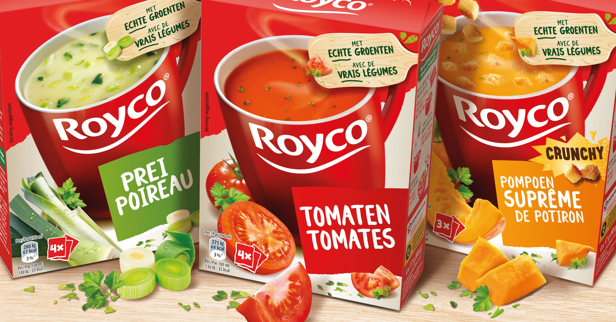
Royco soup & snack range
It was time to add some modernity to this great soup brand used as much as home as at the office and to increase its appeal. Who doesn’t know the famous Mr Roy advertising campaigns in Belgium?
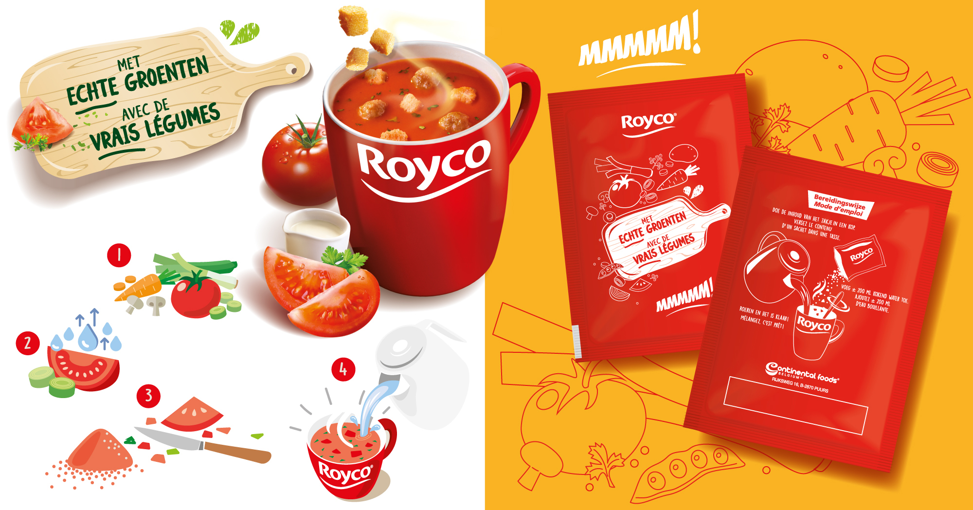
New typefaces, balanced image compositions and a new young fresh look. We made sure the iconic red cup with the Royco branding would catch the eye in an instant! Showing a wooden kitchen board and vegetables made it clear that even though the soup is dehydrated, Royco contains real vegetables!
We visualized how the production process works to make the consumer fully understand it. Therefore, we created a range of illustrations, used all over packaging and in communication. It is now 100% clear that Royco is made with real vegetables!
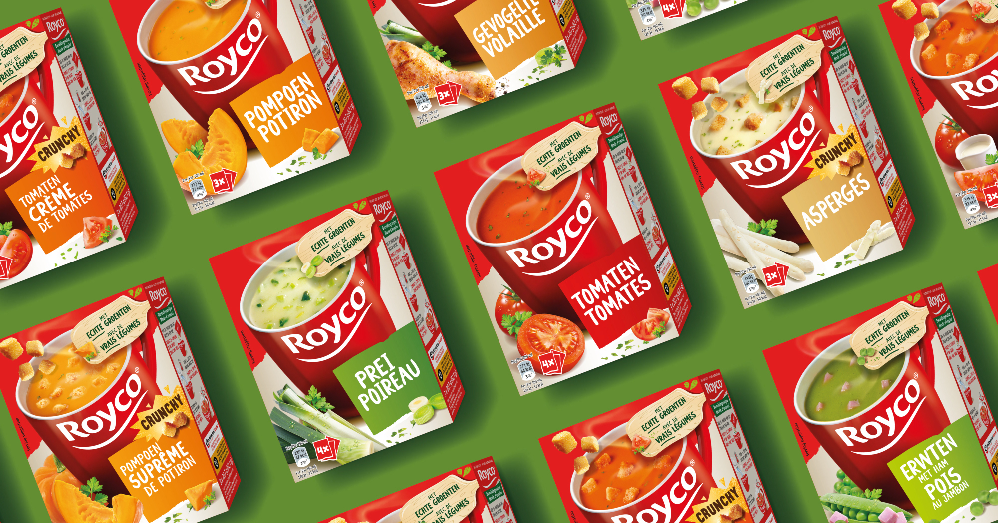
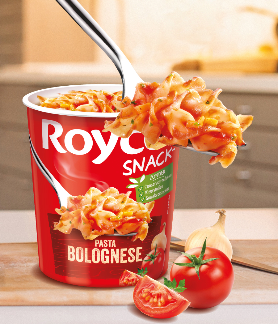
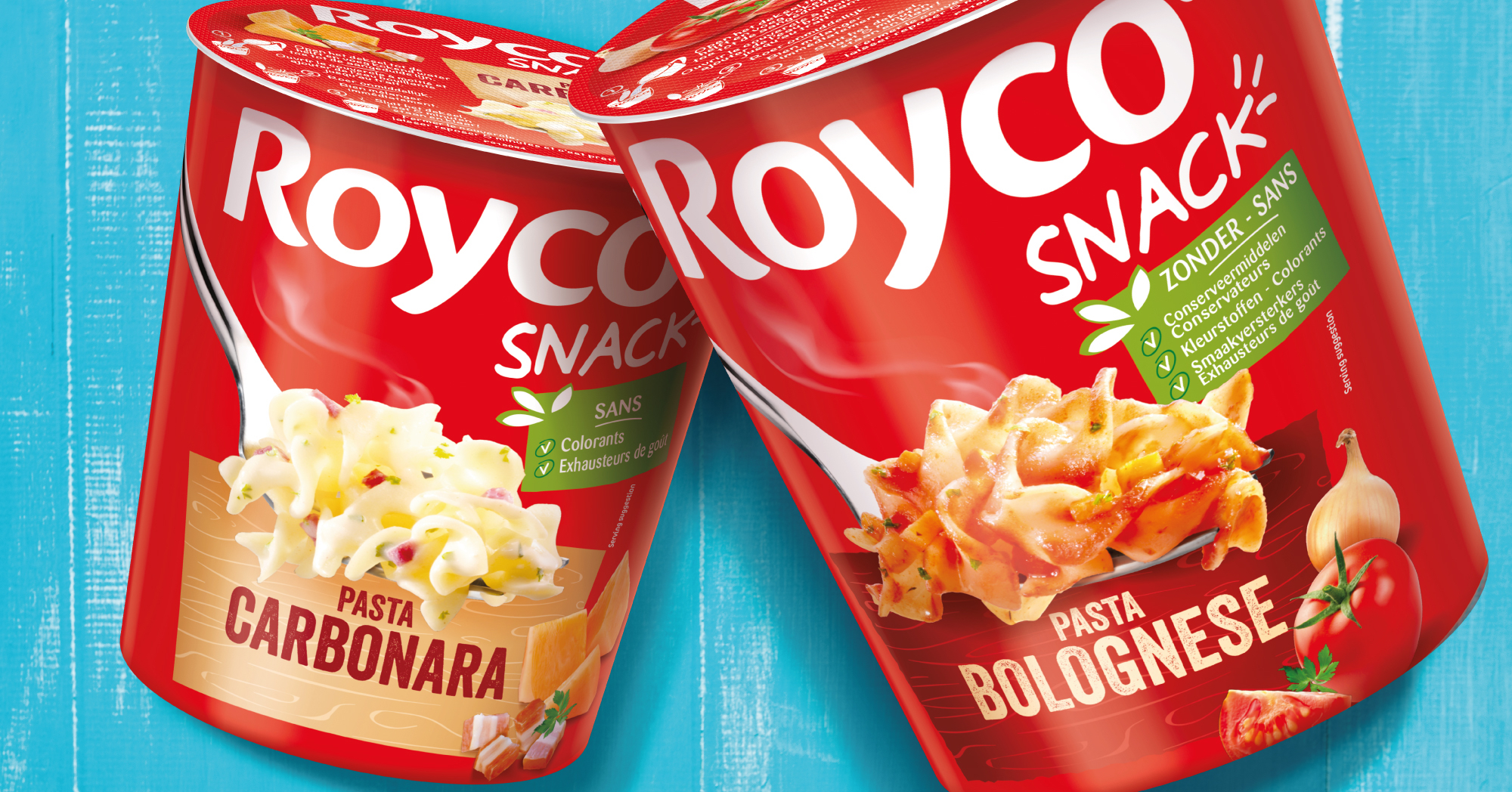
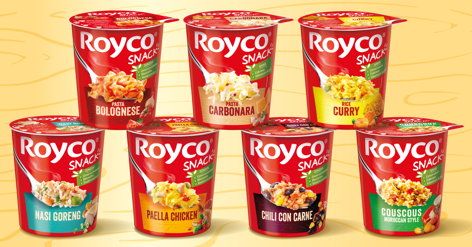
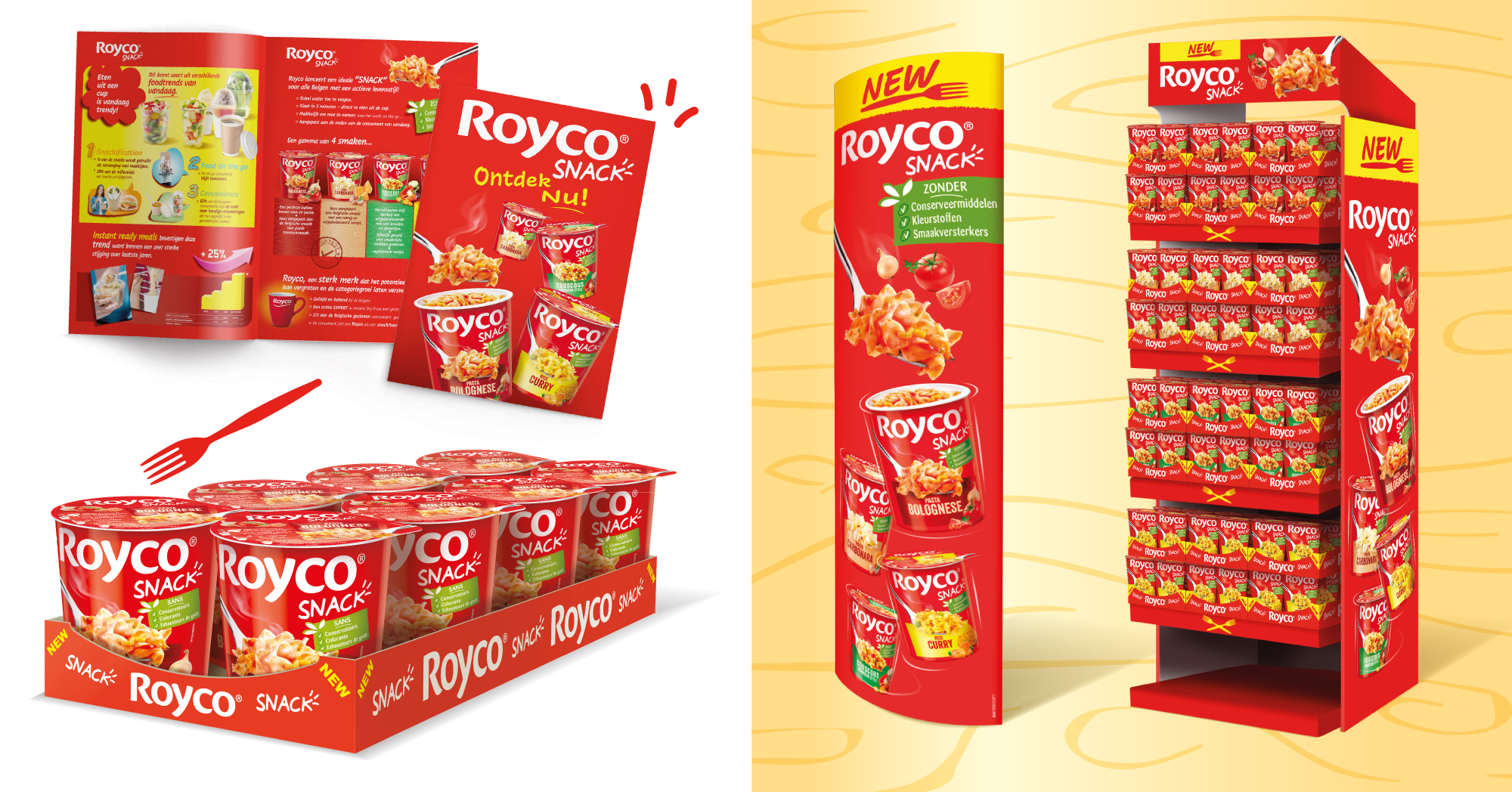
Royco also launched a range of easy to prepare snacks in cups and we developed the packaging identity.
For both brands we were also responsible for the development of the point of sales material and visual assets used for the e-commerce.
Others Projects